Default Header
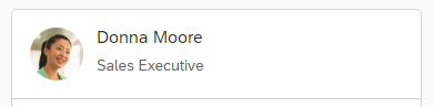
The header displays general information about the card. Using properties you can configure the title, subtitle, status text, and icon.
Usage
You should always set a title. To show a KPI or any numeric information, use the numeric header instead.
Properties
| Property | Type | Default Value | Required | Description | Schema Version | Since |
|---|---|---|---|---|---|---|
| type | string | No | The type of the header. Should be set to "Default" or omitted. | 1.14.0 | 1.64 | |
| title | string | Yes | The title. | 1.14.0 | 1.64 | |
| titleMaxLines | int | 3 | No |
Limits the number of lines for the title. Note: This property is experimental and may change! |
1.47.0 | 1.107 |
| subTitle | string | No | The subtitle. | 1.14.0 | 1.64 | |
| subtitleMaxLines | int | 2 | No |
Limits the number of lines for the subtitle. Note: This property is experimental and may change! |
1.47.0 | 1.107 |
| icon | Icon | No | Represents the icon of the card. Note: The default value of the icon depends on the icon shape |
1.14.0 | 1.64 | |
| status | HeaderStatus | No | Represents the status of the card. | 1.14.0 | 1.64 | |
| actions | Actions[] | No | Actions that are triggered when the header is pressed. | 1.15.0 | 1.65 | |
| dataTimestamp | string | No |
Defines the timestamp of the oldest data in the card. Use this to show to the end user how fresh the information in the card is. Must be in ISO 8601 format. Will be shown as a relative time like "5 minutes ago". Note: This property is experimental and may change! |
1.33.0 | 1.89 | |
| visible | boolean | true | No |
Visibility of the card header. If the header is hidden, the menu that holds custom extension or host actions will also be hidden. Therefore, the header should only be hidden in special cases and when it doesn't bring important information. Note: This property is experimental and may change! |
1.47.0 | 1.107 |
| closeButton (deprecated) | CloseButton | No |
Represents the Close button when a card is opened by the ShowCard action. Note: This property is deprecated since 1.333. The button now appears in the footer. You can configure its visibility from there. |
1.59.0 | 1.119 | |
| wrappingType | sap.m.WrappingType | "Normal" | No |
Defines the type of text wrapping to be used inside the header.
This applies to title and subtitle of the header.
|
1.63.0 | 1.122 |
Icon Properties
| Property | Type | Default Value | Required | Description | Schema Version | Since |
|---|---|---|---|---|---|---|
| src | string | No | Icon name or source URL | 1.14.0 | 1.64 | |
| shape | sap.m.AvatarShape | No | The shape of the icon. | 1.14.0 | 1.64 | |
| alt | string | No | Alternative text for the icon. If not provided, a default value is set, which might be confusing for screen reader users, when there are more than one card in the view. | 1.26.0 | 1.82 | |
| backgroundColor | sap.m.AvatarColor | No |
By default it is set to "Transparent". Note: This property is experimental and may change! |
1.27.0 | 1.83 | |
| initials | string | No | Used as fallback if the "src" property is not set or there is an issue with the resource. Up to two Latin letters can be displayed. If there are more than two letters, or if there's a non-Latin character present, a default image placeholder will be created. | 1.47.0 | 1.107 | |
| visible | boolean | true | No | Defines whether the icon should be displayed. | 1.48.0 | 1.108 |
| fitType | sap.m.AvatarImageFitType | Cover | No | Used to determine how the image will fit in the icon space. | 1.67.0 | 1.130 |
HeaderStatus Properties
| Property | Type | Default Value | Required | Description | Schema Version | Since |
|---|---|---|---|---|---|---|
| text | string | Yes | Status text. | 1.14.0 | 1.64 | |
| visible | boolean | true | No |
Defines whether the status should be displayed.
Note: This property is experimental and may change! |
1.56.0 | 1.116 |
Example
"header": {
	"title": "An example title",
	"subTitle": "Some subtitle",
	"icon": {
		"src": "sap-icon://business-objects-experience",
		"visible": true
	},
	"status": {
		"text": "5 of 20"
	}
}
Try It Out