Text Badge
Overview
Badges can be used to display very short and important information, that attracts the user attention.
Typical usages in the case of cards are:
- The card is new in the user's home page.
- The card is added to the home page by the user.
- The card is added to the user's home page by an admin or key user.
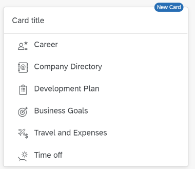
When to Use
Use the badge when:
- The card is new in the user's home page.
- The card is added to the user's home page by an admin, key user or the user himself.
Do not use the badge if:
- You want to display the message text 'temporarily unavailable'. Use the disabled state of the card instead.
- The card should not be visible or used by the user. Don’t display the card in the home page in this case.
- To display a message to the user.
- You want to display a counter. Use the numeric header of the card instead.
Behavior and Interaction
The badge automatically disappears when the user activates (e.g. clicks, taps) the card, or when the focus is on the card (or the card's content) for more than 3 seconds.
Example
Use the Badge in UI5
To display a Badge in a Card, you need to create a BadgeCustomData with a specific text and add it to the "customData" aggregation of the Card.For more information, see
BadgeCustomData
An example with a Card with a Badge would look like:
<mvc:View xmlns="sap.m" xmlns:w="sap.ui.integration.widgets">
	<w:Card id="card1" manifest="./manifest.json">
		<w:customData>
			<BadgeCustomData value="New Card" />
		</w:customData>
	</w:Card>
</mvc:View>
A typical usage using data binding would look like:
Controller:
// JSONModel required from "sap/ui/model/json/JSONModel"
const model = new JSONModel({
	badgeText: "New"
});
this.getView().setModel(model);
XML View:
<mvc:View xmlns="sap.m" xmlns:w="sap.ui.integration.widgets">
	<w:Card id="card1" manifest="./manifest.json">
		<w:customData>
			<BadgeCustomData value="{/badgeText}" />
		</w:customData>
	</w:Card>
</mvc:View>
Try it Out
Use the Badge in an HTML Page
To display a Badge when the Card is consumed as an HTML custom element, write its text to the "badge" attribute of the element.<html> <head> <script id="sap-ui-bootstrap" src="https://ui5.sap.com/resources/sap-ui-integration.js" data-sap-ui-compatVersion="edge"> </script> </head> <body> <ui-integration-card manifest="./manifest.json" badge="New"></ui-integration-card> </body> </html>Try it Out