Step 4: Smart Form
SmartForm control is used to obtain a form-like layout for
several controls.SmartForm internally uses the sap.ui.layout.form.Form
control. When using the SmartForm control in combination with the
SmartField controls, the view.xml file remains
very compact since required information about labels and headers is automatically
extracted from the OData metadata. In addition, you can specify in
SmartForm that it is toggle-editable in which case you get the
option to switch between read-only and edit mode. In this case, the powerful features of
the SmartField control really come to life, such as the value help and
the smart links.
Preview
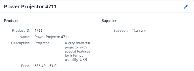
When you press the pencil icon, the dialog for SmartForm becomes
editable:
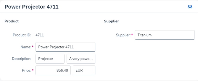
When pressing the eyeglasses icon, you return to the display view of
SmartForm.
Coding
You can view and download all files in the Samples in the Demo Kit at Smart Controls - Step 4 - Smart Form.
SmartForm.view.xml
<mvc:View
	xmlns="sap.m"
	xmlns:mvc="sap.ui.core.mvc"
	controllerName="sap.ui.demo.smartControls.SmartForm"
	xmlns:smartForm="sap.ui.comp.smartform"
	xmlns:smartField="sap.ui.comp.smartfield">
	<smartForm:SmartForm
		id="smartForm"
		editTogglable="true"
		title="{Name}"
		flexEnabled="false">
		<smartForm:Group label="Product">
			<smartForm:GroupElement>
				<smartField:SmartField value="{ProductId}" />
			</smartForm:GroupElement>
			<smartForm:GroupElement>
				<smartField:SmartField value="{Name}" />
			</smartForm:GroupElement>
			<smartForm:GroupElement elementForLabel="1">
				<smartField:SmartField value="{CategoryName}" />
				<smartField:SmartField value="{Description}" />
			</smartForm:GroupElement>
			<smartForm:GroupElement>
				<smartField:SmartField value="{Price}" />
			</smartForm:GroupElement>
		</smartForm:Group>
		<smartForm:Group label="Supplier">
			<smartForm:GroupElement>
				<smartField:SmartField value="{SupplierName}" />
			</smartForm:GroupElement>
		</smartForm:Group>
	</smartForm:SmartForm>
</mvc:View>
We see that we have several new elements here. Group instructs the
SmartForm to add a container for the child elements. In this
case, we have two top-level containers of elements, one for Product
and one for Supplier. With the GroupElement added
as a wrapper control for SmartFields, we instruct the
SmartForm to inspect the OData metadata and automatically add
the labels found there. Within such GroupElements, we can even
define a compound field having exactly one label in front. We do this in the example
above in order to combine CategoryName with
Description. With elementForLabel="1" we
define that the label Description for SmartField
(found in the OData metadata) is used for both fields.
flexEnabled="false" is set to deactivate SAPUI5 flexibility,
since these features are not part of this tutorial.
SmartForm.controller.js
sap.ui.define([
	"sap/ui/core/mvc/Controller"
], function(Controller) {
	"use strict";

	return Controller.extend("sap.ui.demo.smartControls.SmartForm", {
		onInit: function() {
			this.getView().byId("smartFormPage").bindElement("/Products('4711')");
		}
	});

});
The controller follows the pattern that we already know.
metadata.xml
<?xml version="1.0" encoding="utf-8"?>
<edmx:Edmx Version="1.0"
	xmlns:edmx="http://schemas.microsoft.com/ado/2007/06/edmx"
	xmlns:m="http://schemas.microsoft.com/ado/2007/08/dataservices/metadata"
	xmlns:sap="http://www.sap.com/Protocols/SAPData">
	<edmx:DataServices m:DataServiceVersion="2.0">
		<Schema Namespace="com.sap.wt04"
			sap:schema-version="1" xmlns="http://schemas.microsoft.com/ado/2008/09/edm">
			<EntityType Name="Product">
				<Key>
					<PropertyRef Name="ProductId" />
				</Key>
				<Property Name="ProductId" Type="Edm.String" Nullable="false"
					sap:updatable="false" MaxLength="20" sap:label="Product ID" />
				<Property Name="Name" Type="Edm.String" Nullable="false"
					MaxLength="30" sap:label="Name" />
				<Property Name="CategoryName" Type="Edm.String" sap:label="Category Description"
					sap:updatable="true" />
				<Property Name="Description" Type="Edm.String" MaxLength="256"
					sap:label="Description" sap:updatable="true" />
				<Property Name="Price" Type="Edm.String" Nullable="false"
					sap:unit="CurrencyCode" MaxLength="3" sap:label="Price"
					sap:updatable="true" />
				<Property Name="CurrencyCode" Type="Edm.String" Nullable="true"
					MaxLength="3" sap:label="Currency" sap:semantics="currency-code"
					sap:updatable="true" />
				<Property Name="SupplierName" Type="Edm.String" Nullable="false"
					sap:label="Supplier" sap:updatable="true" />
			</EntityType>
			<EntityContainer m:IsDefaultEntityContainer="true"
				sap:supported-formats="atom json">
				<EntitySet Name="Products" EntityType="com.sap.wt04.Product" />
			</EntityContainer>
		</Schema>
	</edmx:DataServices>
</edmx:Edmx>
With Nullable="false" we define that the field is mandatory and
therefore cannot be null. The label for the mandatory field is then marked with * on
the UI. Other than that, there are no substantial differences in the metadata file.
We only notice that the sap:label attributes defined here appear in
the final form as explained before.
Products.json
[{
	"ProductId": "4711",
	"Name": "Power Projector 4711",
	"CategoryName": "Projector",
	"SupplierName": "Titanium",
	"Description": "A very powerful projector with special features for Internet usability, USB",
	"Price": 856.49,
	"CurrencyCode": "EUR"
}]
We see that a few attributes have been changed and added to the JSON file, reflecting the fact that, in this step, more data is shown.
Parent topic: Smart Controls Tutorial
Previous: Step 3: Smart Field with Smart Link