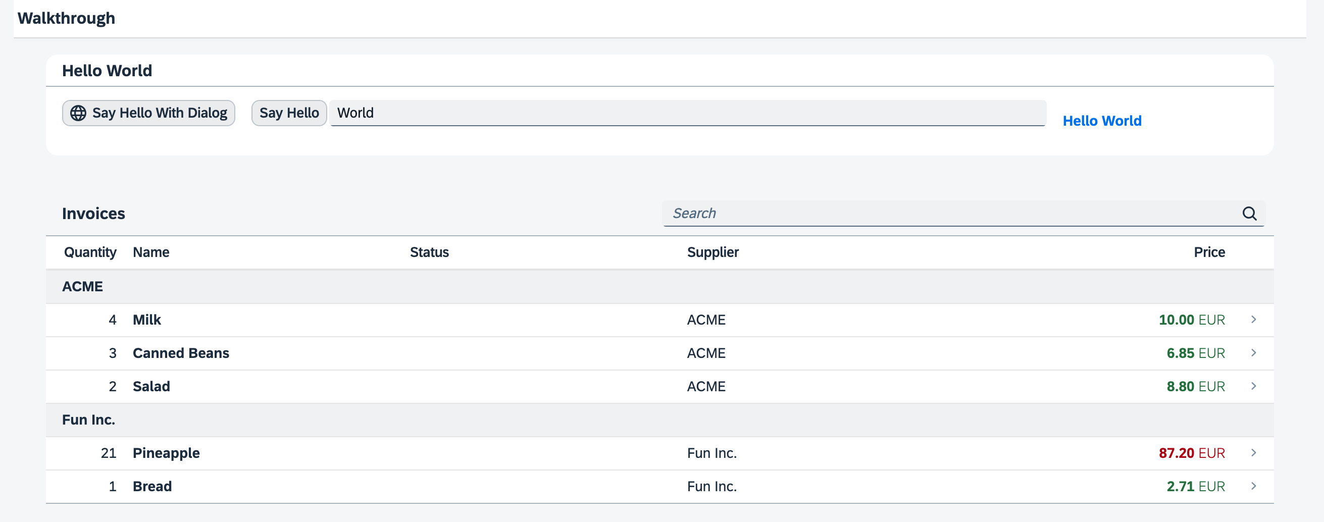
Step 36: Content Density
Preview

Coding
You can view and download all files at Walkthrough - Step 36.
webapp/Component.js
...

		getContentDensityClass() {
			return Device.support.touch ? "sapUiSizeCozy" : "sapUiSizeCompact";
		}
	});
});
To prepare the content density feature we will also add a helper method
getContentDensityClass. SAPUI5 controls can be
displayed in multiple sizes, for example in a compact size that is
optimized for desktop and non-touch devices, and in a cozy mode
that is optimized for touch interaction. The controls look for a specific CSS class
in the HTML structure of the application to adjust their size.
This helper method queries the Device API directly for touch
support of the client and returns the CSS class sapUiSizeCompact if
touch interaction is not supported and sapUiSizeCozy for all other
cases. We will use it throughout the application coding to set the proper content
density CSS class.
webapp/controller/App.controller.js
sap.ui.define([
	"sap/ui/core/mvc/Controller"
], (Controller) => {
	"use strict";

	return Controller.extend("ui5.walkthrough.controller.App", {

		onInit() {
			this.getView().addStyleClass(this.getOwnerComponent().getContentDensityClass());
		}
	});
});onInit method to the app controller that is called when the app view is instantiated. There, we query the
helper function that we defined on the app component in order to set the corresponding style class on the app view. All controls inside
the app view will now automatically adjust to either the compact or the cozy size, as defined by the style.webapp/manifest.json
...
  "sap.ui5": {
    ...
    },
    "contentDensities": {
      "compact": true,
      "cozy": true
    }
    ...
  }
In the contentDensities section of the sap.ui5 namespace, we have to specify the modes that the application
supports. Containers like the SAP Fiori launchpad allow switching the content density
based on these settings.
As we have just enabled the app to run in both modes depending on the devices
capabilities, we can set both to true in the application
descriptor.
Parent topic: Walkthrough Tutorial (JavaScript)
Previous: Step 35: Device Adaptation
Next: Step 37: Accessibility