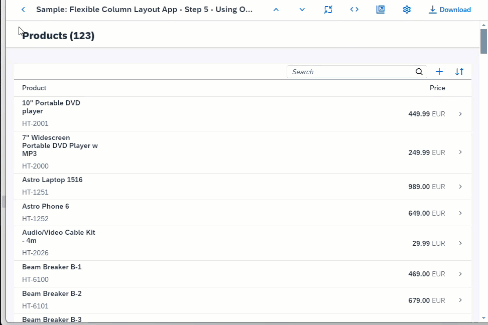
Step 5: Using Object Page Layout as a Detail Page
sap.uxap.ObjectPageLayout to the detail page to display more information about each
product.The ObjectPageLayout control provides a layout that allows apps to easily display information related to a business
object.
As of version 1.52, the
control can have the same dynamic header that
is used in the sap.f.DynamicPage. This ensures the availability of
features, such as, breadcrumbs navigation, navigation actions, and expanding/collapsing
the header by tapping/clicking the title area or by selecting the available arrow
buttons. For more information, see Object Page Header.
Compared to sap.f.DynamicPage, the sap.uxap.ObjectPageLayout can provide a more structured page content
using an optional anchor bar and block content wrapped in sections and subsections that structure the information. For more information,
see Object Page Layout.
Coding
You can view and download all files at Flexible Column Layout App - Step 5.
webapp/manifest.json [MODIFY]
{
	"_version": "1.38.0",
	"sap.app": {
		"id": "sap.ui.demo.fcl",
		"type": "application",
		"applicationVersion": {
			"version": "1.0.0"
		}
	},
	"sap.ui5": {
		"rootView": {
			"viewName": "sap.ui.demo.fcl.view.App",
			"type": "XML",
			"async": true,
			"id": "fcl"
		},
		"dependencies": {
			"minUI5Version": "1.98.0",
			"libs": {
				"sap.f": {},
				"sap.m": {},
				"sap.ui.core": {},
				"sap.uxap": {}
				}
		},
		"config": {
			"fullWidth": true
		}
	}
}
First, we add the related libraries that we will need to the dependencies in the manifest.json.
webapp/view/Detail.view.xml [MODIFY]
<mvc:View
	xmlns="sap.uxap"
	xmlns:m="sap.m"
	xmlns:f="sap.f"
	xmlns:form="sap.ui.layout.form"
	xmlns:mvc="sap.ui.core.mvc">
	<ObjectPageLayout
		id="ObjectPageLayout"
		showTitleInHeaderContent="true"
		alwaysShowContentHeader="false"
		preserveHeaderStateOnScroll="false"
		headerContentPinnable="true"
		isChildPage="true"
		upperCaseAnchorBar="false">
	</ObjectPageLayout>
</mvc:View>
We add an instance of the sap.uxap.ObjectPageLayout control.
webapp/view/Detail.view.xml [MODIFY]
<mvc:View
	xmlns="sap.uxap"
	xmlns:m="sap.m"
	xmlns:f="sap.f"
	xmlns:form="sap.ui.layout.form"
	xmlns:mvc="sap.ui.core.mvc">
	<ObjectPageLayout
		id="ObjectPageLayout"
		showTitleInHeaderContent="true"
		alwaysShowContentHeader="false"
		preserveHeaderStateOnScroll="false"
		headerContentPinnable="true"
		isChildPage="true"
		upperCaseAnchorBar="false">
		<headerTitle>
			<ObjectPageDynamicHeaderTitle>
				<actions>
					<m:ToggleButton
						text="Edit"
						type="Emphasized"/>
					<m:Button
						text="Delete"
						type="Transparent"/>
					<m:Button
						text="Copy"
						type="Transparent"/>
					<m:Button
						icon="sap-icon://action"
						type="Transparent"/>
				</actions>
			</ObjectPageDynamicHeaderTitle>
		</headerTitle>

	</ObjectPageLayout>
</mvc:View>
We add the recommended dynamic header with an instance of the
ObjectPageDynamicHeaderTitle in the
headerTitle aggregation of the
ObjectPageLayout.
webapp/view/Detail.view.xml [MODIFY]
		...
		<headerTitle>
			<ObjectPageDynamicHeaderTitle>
				<actions>
					<m:ToggleButton
						text="Edit"
						type="Emphasized"/>
					<m:Button
						text="Delete"
						type="Transparent"/>
					<m:Button
						text="Copy"
						type="Transparent"/>
					<m:Button
						icon="sap-icon://action"
						type="Transparent"/>
				</actions>
			</ObjectPageDynamicHeaderTitle>
		</headerTitle>

		<headerContent>
			<m:FlexBox wrap="Wrap" fitContainer="true" alignItems="Stretch">
				<m:Avatar
					displaySize="L"
					displayShape="Square"
					class="sapUiTinyMarginEnd">
				</m:Avatar>
				<m:VBox justifyContent="Center" class="sapUiSmallMarginEnd">
					<m:Label text="Main Category"/>
				</m:VBox>
				<m:VBox justifyContent="Center" class="sapUiSmallMarginEnd">
					<m:Label text="Subcategory"/>
				</m:VBox>
				<m:VBox justifyContent="Center" class="sapUiSmallMarginEnd">
					<m:Label text="Price"/>
				</m:VBox>
			</m:FlexBox>
		</headerContent>

	</ObjectPageLayout>
</mvc:View>
We add content in the headerContent aggregation. We're using sap.m.Avatar as the recommended SAP Fiori control for displaying images.
webapp/view/Detail.view.xml [MODIFY]
		...
		<headerContent>
			<m:FlexBox wrap="Wrap" fitContainer="true" alignItems="Stretch">
				<m:Avatar
					displaySize="L"
					displayShape="Square"
					class="sapUiTinyMarginEnd">
				</m:Avatar>
				<m:VBox justifyContent="Center" class="sapUiSmallMarginEnd">
					<m:Label text="Main Category"/>
				</m:VBox>
				<m:VBox justifyContent="Center" class="sapUiSmallMarginEnd">
					<m:Label text="Subcategory"/>
				</m:VBox>
				<m:VBox justifyContent="Center" class="sapUiSmallMarginEnd">
					<m:Label text="Price"/>
				</m:VBox>
			</m:FlexBox>
		</headerContent>

		<sections>
			<ObjectPageSection title="General Information">
				<subSections>
					<ObjectPageSubSection>
						<blocks>
							<form:SimpleForm
								maxContainerCols="2"
								editable="false"
								layout="ResponsiveGridLayout"
								labelSpanL="12"
								labelSpanM="12"
								emptySpanL="0"
								emptySpanM="0"
								columnsL="1"
								columnsM="1">
								<form:content>
									<m:Label text="Product ID"/>
									<m:Label text="Description"/>
									<m:Label text="Supplier"/>
								</form:content>
							</form:SimpleForm>
						</blocks>
					</ObjectPageSubSection>
				</subSections>
			</ObjectPageSection>

			<ObjectPageSection title="Suppliers">
				<subSections>
					<ObjectPageSubSection>
						<blocks>
							<m:Table
								id="suppliersTable"
								items="{path : 'products>/ProductCollectionStats/Filters/1/values'}">
								<m:columns>
									<m:Column/>
								</m:columns>
								<m:items>
									<m:ColumnListItem type="Navigation">
										<m:cells>
											<m:ObjectIdentifier text="{products>text}"/>
										</m:cells>
									</m:ColumnListItem>
								</m:items>
							</m:Table>
						</blocks>
					</ObjectPageSubSection>
				</subSections>
			</ObjectPageSection>
		</sections>
	</ObjectPageLayout>
</mvc:View>
Finally, we add page content in two separate sections with blocks. For more information, see Object Page Blocks.
Parent topic: Flexible Column Layout App Tutorial
Previous: Step 4: Adding a Detail Page