Configuring the Content of Quick Views
The content area, consisting of a title and additional information, for example, a field group, has a default behavior and can be adapted to your needs.
Title Area
-
Images
-
To display an image, annotate
HeaderInfo.ImageUrlorHeaderInfo.TypeImageUrl. If you don't, no image is displayed. -
If you annotate
HeaderInfo.ImageUrlandHeaderInfo.TypeImageUrl,ImageUrlis evaluated first, andTypeImageUrlsecond. TheImageUrl/TypeImageUrlstring and path including navigation properties are evaluated.
-
-
Title
-
Enter the title according to the
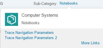
TextArrangementannotation. See the figure below:TextArrangementType/TextLast. Note that Computer Systems is declared asTextLasthere.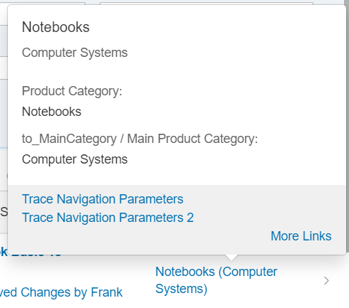
-
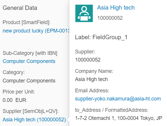
If a main navigation has been defined, the title is displayed as a link. In the example below, see the Asia High tech link:
-
- Description
-
The description is always displayed beneath the title and must be filled according to the
TextArrangementannotation. -
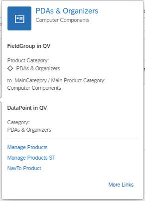
If the description is not filled, the title size is increased automatically and the description field remains empty, as shown below (
TextArrangementType/TextOnly).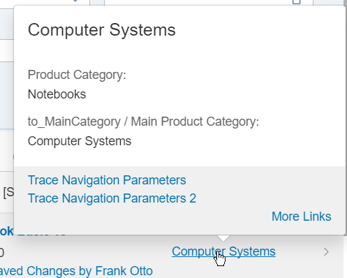
-
Content Area
The content area can contain field groups, contacts, and Datapoints.
Field Groups
-
You can include any number of field groups or none at all. The example below shows a quick view with no reference facet, however, a header image included:
-
A field group can have a label. It' taken from within the
<Record
							Type="UI.ReferenceFacet">
. -
For fields, the path including navigation properties is evaluated.
-
Fields support annotations such as
IsEmailAddress,IsUrl, andIsPhoneNumber. Note that any links that would create a popover on the quick view are ignored by the system. -
There are different types of content for field groups:
-
Interpreted by
SmartField:DataFieldincluding criticality,DataFieldWithUrl -
Interpreted by SAP Fiori elements:
DataFieldWithIntentBasedNavigation
-
Contacts
You can display any number of contacts or none at all. See the example below:
The following applies:
-
You can place the contact anywhere. It's specified by the position of the reference facet in the collection.
-
If the picture, title, and description belonging to a contact (contact title area) correspond with the content of the title area , the contact title area is not displayed.
-
The reference facet must point to a
com.sap.vocabularies.Communication.v1.Contact.
DataPoints
-
You can place an existing DataPoint in your annotation.
-
You can place the DataPoint anywhere. It's specified by the position of the reference facet in the collection.
-
A DataPoint can have a label. It's taken from within the
<Record
								Type="UI.ReferenceFacet">
.
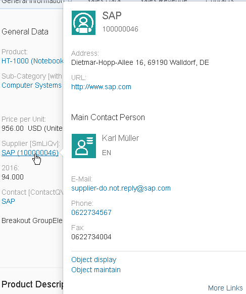
The sample codes show a quick view facet containing field group, contact and DataPoint:
XML Annotation
<Annotations Target="STTA_PROD_MAN.STTA_C_MP_SupplierType"> <Annotation Term="UI.QuickViewFacets"> <Collection> <Record Type="UI.ReferenceFacet"> <PropertyValue Property="Target" AnnotationPath="@UI.FieldGroup#SupplierQuickViewPOC_FieldGroup_1" /> </Record> <Record Type="UI.ReferenceFacet"> <PropertyValue Property="Label" String="Main Contact Person" /> <PropertyValue Property="Target" AnnotationPath="@Communication.Contact#KeyAccount"/> </Record> <Record Type="UI.ReferenceFacet"> <PropertyValue Property="Label" String="DataPoint in QV"/> <PropertyValue Property="Target" AnnotationPath="@UI.DataPoint#Product"/> </Record> </Collection> </Annotation></Annotations>
ABAP CDS Annotation
annotate view STTA_C_MP_SUPPLIER with {@UI.Facet: [ { targetQualifier: 'SupplierQuickViewPOC_FieldGroup_1', type: #FIELDGROUP_REFERENCE, purpose: #QUICK_VIEW }, { label: 'Main Contact Person', targetQualifier: 'KeyAccount', type: #CONTACT_REFERENCE, purpose: #QUICK_VIEW }, { label: 'DataPoint in QV', targetQualifier: 'Product', type: #DATAPOINT_REFERENCE, purpose: #QUICK_VIEW }]supplier;}Title Area
-
Images
To display an image, provide at least one of the following annotations:
-
HeaderInfo.ImageUrl -
HeaderInfo.TypeImageUrl -
HeaderInfo.Initials(to display initials as an image)
-
-
Title
-
The title is taken from
HeaderInfo.Title. -
If a main navigation has been defined using the
sap-tagparameterprimaryAction, the title is displayed as a link. For more information about how to define a primary action, see Primary actions.In the example below, see the Asia High tech link:
Navigation from the title link using the browser option Open link in new tab is not possible. Instead, the navigation links to SAP Fiori launchpad.
-
- Description
-
The description is taken from the
HeaderInfo.Descriptionannotation of the target entity. -
If the
HeaderInfo.Descriptionis not maintained in the annotation, the subtitle displays the label of the source property.
-
Content Area
The content area can contain field groups, contacts, and
DataPoints.
Field Groups
-
You can include any number of field groups or none at all. The example below shows a quick view without a reference facet, but with a header image:

-
A field group can have a label. It's taken from within the
Record
								Type="UI.ReferenceFacet"
. -
For fields, the path including navigation properties is evaluated.
-
Fields support annotations such as
IsEmailAddress,IsUrl, andIsPhoneNumber. Note that any links that create a popover on the quick view are ignored by the system.
You can display any number of contact facets or none at all. See the example below:
The following applies:
-
You can place contact facets anywhere. The position is specified by the position of the reference facet in the collection of the
UI.QuickViewFacetsannotation. -
The reference facet for each contact facet must point to a
com.sap.vocabularies.Communication.v1.Contactannotation. -
If the picture, title, and description belonging to a contact (contact title area) correspond with the content of the title area, the contact title area is not displayed.
-
You can place the
DataPointfacets anywhere. The position is specified by the position of the reference facet in the collection of theUI.QuickViewFacetsannotation. -
The reference facet for each
DataPointmust point to aUI.DataPointannotation. -
Each
DataPointcan have a label. It's taken from theRecord Type="UI.ReferenceFacet".
The sample codes show a quick view facet containing field group, contact and
DataPoint:
XML Annotation
<Annotations Target="STTA_PROD_MAN.STTA_C_MP_SupplierType">
    <Annotation Term="UI.QuickViewFacets">
        <Collection>
            <Record Type="UI.ReferenceFacet">
                <PropertyValue Property="Target" AnnotationPath="@UI.FieldGroup#SupplierQuickViewPOC_FieldGroup_1" />
            </Record>
            <Record Type="UI.ReferenceFacet">
                <PropertyValue Property="Label" String="Main Contact Person" />
                <PropertyValue Property="Target" AnnotationPath="@Communication.Contact#KeyAccount"/>
            </Record>
            <Record Type="UI.ReferenceFacet">
                <PropertyValue Property="Label" String="DataPoint in QV"/>
                <PropertyValue Property="Target" AnnotationPath="@UI.DataPoint#Product"/>
            </Record>
        </Collection>
    </Annotation>
</Annotations>
ABAP CDS Annotation
Annotate view STTA_C_MP_SUPPLIER with
{
    @UI.Facet: [
        {
            targetQualifier: 'SupplierQuickViewPOC_FieldGroup_1',
            type: #FIELDGROUP_REFERENCE,
            purpose: #QUICK_VIEW
        },
        {
            label: 'Main Contact Person',
            targetQualifier: 'KeyAccount',
            type: #CONTACT_REFERENCE,
            purpose: #QUICK_VIEW
        },
        {
            label: 'DataPoint in QV',
            targetQualifier: 'Product',
            type: #DATAPOINT_REFERENCE,
            purpose: #QUICK_VIEW
        }
    ]
    supplier;
}
CAP CDS Annotation
Annotate STTA_PROD_MAN.STTA_C_MP_SupplierType with
@(
    UI.QuickViewFacets : [
        {
            $Type : 'UI.ReferenceFacet',
            Target : '@UI.FieldGroup#SupplierQuickViewPOC_FieldGroup_1'
        },
        {
            $Type : 'UI.ReferenceFacet',
            Label : 'Main Contact Person',
            Target : '@Communication.Contact#KeyAccount'
        },
        {
            $Type : 'UI.ReferenceFacet',
            Label : 'DataPoint in QV',
            Target : '@UI.DataPoint#Product'
        }
    ]
);
Footer Section
To enable navigation from a quick view facet, define a
SemanticObject for the source property (if a
ReferentialConstraints exists) or for the navigation
property (if the target property is defined using an association).
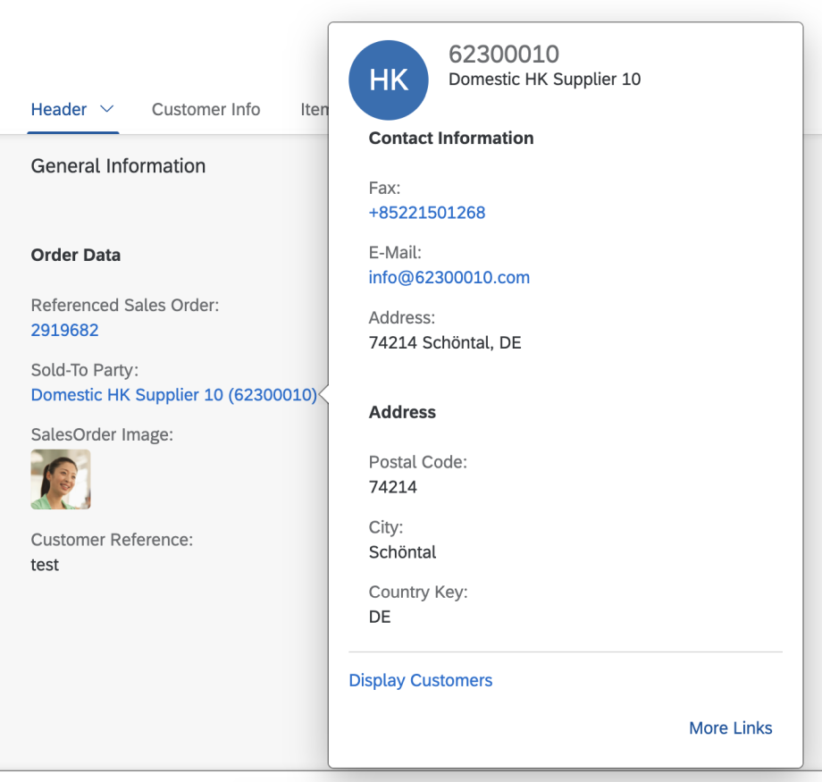
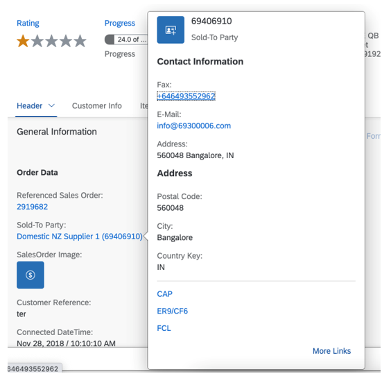
The following image shows a quick view popover displaying the most important links in the footer:
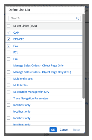
The following image shows a More Links popover. Users can select actions to be displayed in the quick view footer:
-
The footer section gathers the most important navigation targets. Users can see the full list of available actions by choosing the More Links button.
-
Important navigation targets are defined using the
sap-tagparametersuperiorAction. All actions with this definition are displayed by default in the quick view footer. -
If no action was defined using the
sap-tagparametersuperiorAction, the first three actions in the list of actions are shown by default. -
Users can personalize the actions shown in the footer by selecting actions in the More Links popover.
When the application is running within an i-frame, using the browser's Open link
in new tab option to navigate from action links isn't
supported. Additionally, any processing defined in the
IntentBasedNavigation extension point isn't executed in
this scenario. For
more information about the IntentBasedNavigation API,
see the API Reference.
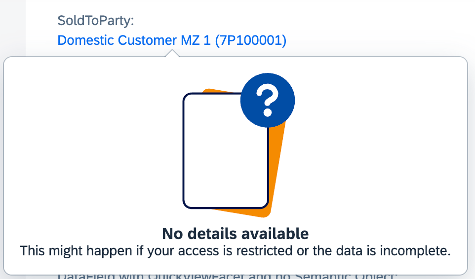
When no QuickView annotations are defined and no target is
resolved at runtime (for example, the user does not have access to the
target applications), the field still appears as a link and a message is
displayed when pressed.