Tables
SAP Fiori elements supports
several table types.
The following table types are available:
-
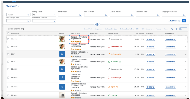
Responsive tables
Responsive tables are optimized for mobile use. Line items can be viewed without
scrolling or with vertical scrolling only, regardless of the display width.
Responsive tables are intended for work on the line level instead of cell level,
and for work with a small number of items.
Only use the responsive table if the total number of
items in the table doesn't exceed 200.
-
Grid table
The
grid table is designed to contain a larger number of items (several thousand or
more), with convenient comparison of items in different rows or
columns.
The grid table is suitable to most use cases on the list report pages.
-
Tree table
This table type provides a comprehensive set of features to display hierarchical
data. For more information, see Tree Tables.
-
Analytical table
The
analytical table offers a comprehensive set of features for working with
analytical data, such as advanced grouping options and data
aggregation.
The table representation that suits the service is chosen by default during the app
creation.
You can change the default table type to suit your needs.
For
more information about defining the UI.LineItem annotation that
describes the table, see Defining Line Items.
The table control uses page mechanisms while loading data. It contains the following:
- Layout management
-
A toolbar with actions rendered as text icons, for example,
Personalize.
-
Application-specific actions rendered as text buttons, for example,
Copy, Approve, and
Delete.
-
An indication of draft status (only for list report tables)
-
A display of items locked by other users (only for list report tables)
Default Selection Mode for Rows in Tables
By default, the table generated by the template uses the single-selection mode. End
users select an item from the table to trigger a custom action, such as
Validate, which then returns the results for the selected
item.
Applications can change the single-selection mode to multi-selection mode. For more
information, see Configuring the Selection Mode for Tables.
Context Menu in Tables
Tables in list report, object page, and analytical list page applications support a
context menu. The context menu is available as a default option and appears only
when end users perform a right-click on a row or a set of selected rows. This menu
displays all context-dependent actions, including both standard and custom actions
that appear on the table toolbar. Additionally, an option to open the selected row
or rows in a new browser tab or window is available within the menu. Inline actions
are not included as part of context menu actions.
When the table is configured to navigate to an object page in edit mode by
setting openInEditMode to true, the
Open in New Tab option is not shown in the context
menu. For more information, see Navigation to an Object Page in Edit Mode.
When implementing custom actions, you can use the
extensionAPI.getSelectedContexts API to identify the rows
associated with the context menu.
You must use the extensionAPI.getSelectedContexts API only
within synchronous code blocks. For more information, see Defining Custom Actions.
Showing or Hiding Columns Based on Importance and Available Screen Size in
Responsive Tables
You can show or hide columns of the list report and object page tables depending on
the screen width for situations like the following:
- The browser window is small.
- The application is running on a devise with a smaller screen.
- You are using the flexible column layout.
The value of the UI.Importance annotation for the field determines
which columns are hidden or moved when the screen size is reduced.
You can use the UI.Importance annotation to set the importance for
table columns as follows:
-
High: Columns with a High importance
setting are visible on all screen sizes. When the screen size is reduced,
the columns shift to a pop-in area but remain visible on the screen.
-
Low: Columns with a Low importance setting
are hidden on the screen when the screen size is reduced.
-
None (default) and Medium: Columns with
None (default) and Medium importance
settings are hidden automatically when the screen size is reduced.
For columns with Low, None, and
Medium settings, the Show More per Row /
Show Less per Row buttons appear in the table toolbar
only if there's at least one hidden column. When the end user clicks the
Show More per Row button, the hidden column information
appears as a text in the pop-in area. To hide the pop-in area, click the
Show Less per Row button.
-
Columns that have no importance setting (None) but
containing a semantic key are considered of High
importance (also when used in a FieldGroup).
-
Columns with a Low importance setting are hidden first
on smaller screens, followed by columns with the settings
None (default) and Medium.
XML
annotation
Sample Code
Hidden
<Annotations Target="STTA_PROD_MAN.STTA_C_MP_ProductSalesPriceType">
    <Annotation Term="UI.LineItem">
        <Collection>
            <Record Type="UI.DataField">
                <PropertyValue Property="Value" Path="PriceDay" />
                <Annotation Term="UI.Importance" EnumMember="UI.ImportanceType/High" />
            </Record>
            <Record Type="UI.DataField">
                <PropertyValue Property="Value" Path="TargetPrice" />
                <!-- This will be treated with default importance "None" which is the same as "Medium" -->
            </Record>
            <Record Type="UI.DataField">
                <PropertyValue Property="Value" Path="DiscountPriceTarget" />
                <Annotation Term="UI.Importance" EnumMember="UI.ImportanceType/Low" />
            </Record>
        </Collection>
    </Annotation>
</Annotations>
Starting from SAPUI5 1.87, SAP Fiori elements
automatically calculates the default column width and provides an option to
resize the column width in responsive tables. This is the default behavior.
Having fewer columns in a table increases the free space available on the right
side of the table.
Hiding Table Columns Using the UI.Hidden Annotation
You can hide the table columns or specific fields within the table column in an
analytical list page, list report, and object page. To hide the entire table column,
set the UI.Hidden annotation value for any field as static
true. To hide a specific field of a table column, set the
UI.Hidden annotation value as a path-based value, and the
fields for which UI.Hidden evaluates to true are
hidden. For more information, see Hiding Features Using the UI.Hidden Annotation.
If the path-based value for UI.Hidden evaluates to
true for all rows, then only the fields are hidden and not
the entire column.
DataField Records in Tables
XML
Annotation
Sample Code
Hidden
<Annotation Term="UI.LineItem">
    <Collection>
        <Record Type="UI.DataFieldForAnnotation">
            <PropertyValue Property="Target" AnnotationPath="@UI.FieldGroup#multipleActionFields" />
            <PropertyValue Property="Label" String="Sold-To Party" />
            <Annotation Term="UI.Hidden" Path="Delivered" />
        </Record>
    </Collection>
</Annotation>
ABAP CDS
Annotation
Sample Code
Hidden
@UI.lineItem: [{
    type: #AS_FIELDGROUP,
    valueQualifier: 'multipleActionFields',
    label: 'Sold-To Party',
    hidden: #( 'Delivered' )
}]
TEST;
CAP CDS
Annotation
Sample Code
Hidden
LineItem: {
    $value: [
        {
            $Type: 'UI.DataFieldForAnnotation',
            Target: '@UI.FieldGroup#multipleActionFields',
            Label: 'Sold-To Party',
            ![@UI.Hidden]: Delivered
        }
    ]
}
Searching for Rows in a Table on an Object Page
A search field is displayed in the table toolbar if the used entity set is
searchable. You can use the search bar to search for particular rows in the
table.
Defining the Column Width Using an Annotation
SAP Fiori elements
automatically calculates the default width of columns containing texts based on the
MaxLength property of the field defined in the metadata. The
lower limit is set to 3 rem and the upper limit is set to 20 rem.
To customize the width of a column defined in a line item, use the UI annotation
com.sap.vocabularies.HTML5.v1.CssDefaults. For more
information, see Setting the Default Column Width.
Copying Multiple Rows and Range Selections
End users can copy multiple rows as well as ranges of rows and columns to the
clipboard. The selected content (rows or ranges) can then be pasted to another
application such as Microsoft Excel, Microsoft Word, or to another SAP Fiori elements
table.
When using custom columns in SAP Fiori elements for OData
V4, the
cell content is the properties listed in the property array of
the custom column definition. For more information, see Extension Points for Tables.
To select a range with the mouse, click and hold while dragging to make a selection.
As tables can have cells with editable fields, these fields automatically gain focus
upon cell selection. To prevent this, press CTRL on Microsoft Windows or
CMD on macOS before selecting a cell with the mouse. Keyboard
shortcuts are also available as an alternative for cell selection.
| Key Combination |
Behavior |
| Space |
Selec ts the cell that the focus is set on. If used inside a
selection, removes the selection. |
|
Shift
Arrow keys
|
Adjusts an existing selection. If used outside a selection,
creates a new selection. |
|
Shift
Space
|
Transforms the current selection into a row selection, based on
the selection mode applied to the table. |
|
Control
Space
|
Expands the selection to all cells in a column (up to the range
limit). |
|
Control
Shift
A
|
Clears the selection. |
For more information about pasting data to tables and the expected format, see Copying and Pasting from External Applications to Tables.
Optimizing Data Loading Using the scrollThreshold
Property
As end users scroll within grid tables, tree tables, or analytical tables, the
application dynamically loads additional records from the back-end system. By
default, it loads 300 additional records while scrolling.
You
can modify this value by configuring the scrollThreshold property.
For analytical tables and tree tables, scrollThreshold must be
higher than threshold to take effect.
For more information about configuration in OData V2, see the Configuring the
scrollThreshold
Property for Dynamic Data Loading subsection in the Additional
Features in SAP Fiori elements for OData
V2 section of this topic.
For more information about configuration in OData V4, see the Configuring the
scrollThreshold
Property for Dynamic Data Loading subsection in the Additional
Features in SAP Fiori elements for OData
V4 section of this topic.
Initial Data Loading Using the threshold Property
As responsive, grid, tree, and analytical tables load, the threshold
property defines the number of initially loaded rows.
You can modify this value by configuring the threshold property.
You
can configure the threshold property in the
manifest.json file to specify the number of additional rows
that can be preloaded from the back-end system. The specified value is added to the
number of visible rows. For example, if threshold is set to 100 and
there are 10 visible rows, the table loads a total of 110 records. This property
applies to actions such as initial loading, sorting, and filtering.
If threshold is set to 0, no additional records are preloaded,
and scrollThreshold is used instead.
For more information about configuration in OData V2, see the Configuring
the threshold Property for Initial Data Loading
subsection in the Additional Features in SAP Fiori elements for OData
V2 section of this topic.
For more information about configuration in OData V4, see the Configuring the threshold Property for Initial Data
Loading subsection in the Additional Features in SAP Fiori elements for OData
V4 section of this topic.
Additional Features in SAP Fiori Elements for OData V2
Vertical Alignment of Responsive Tables
To define the vertical alignment for a responsive table, set the
tableColumnVerticalAlignment manifest property under the
settings of sap.ui.generic.app to the values
Top, Middle, or
Bottom.
Showing or Hiding the Copy to Clipboard
Button
By default, the Copy to Clipboard button is displayed in
the table toolbar. However, you can also configure the visibility of the
Copy to Clipboard button by defining the
copy settings in the manifest.json file.
If copy is set to true, the Copy to
Clipboard button is shown in the table toolbar. If
copy is set to false, the Copy
to Clipboard button is hidden from the table toolbar.
Settings for the List
Report
Page
Hidden
"sap.ui.generic.app": {
    "pages": {
        "ListReport|<EntitySetName>": {
            "entitySet": "<EntitySetName>",
            "component": {
                "name": "sap.suite.ui.generic.template.ListReport",
                "settings": {
                    "tableSettings": {
                        "copy": false
                    }
                }
            }
        }
    }
}
Settings for the Analytical
List
Page
Hidden
"sap.ui.generic.app": {
    "pages": {
        "ListReport|<EntitySetName>": {
            "entitySet": "<EntitySetName>",
            "component": {
                "name": "sap.suite.ui.generic.template.AnalyticalListPage",
                "settings": {
                    "tableSettings": {
                        "copy": true
                    }
                }
            }
        }
    }
}
Settings for the Object
Page
Hidden
"sap.ui.generic.app": {
    "pages": {
        "ListReport|<EntitySetName>": {
            ...
            ...
            "pages": {
                "ObjectPage|<EntitySetName>": {
                    "entitySet": "<EntitySetName>",
                    "component": {
                        "name": "sap.suite.ui.generic.template.ObjectPage",
                        "settings": {
                            "sections": {
                                "SalesOrderItemsID": {
                                    "navigationProperty": "<NavigationProperty>",
                                    "entitySet": "<NavigationEntitySetName>",
                                    "tableSettings": {
                                        "copy": true
                                    }
                                }
                            },
                            "tableSettings": {
                                "copy": false
                            }
                        }
                    }
                }
            }
        }
    }
}
The copy settings defined for a table at the section level
have a higher priority than the copy settings defined for
the table at the object page level.
Hiding Columns Using the UI.Hidden Annotation on
an Object Page
Table columns in the object page can be hidden using the
UI.Hidden annotation either with a boolean value
true or with a path referring to the property of the same
entity or parent instance. If it points to a property of the parent entity, then
the entire column is hidden. In the following example,
to_Product is the navigation property pointing to the
parent entity:
XML
Annotation
Sample Code
Hidden
<Annotation Term="UI.LineItem">
    <Collection>
        <Record Type="UI.DataField">
            <PropertyValue Property="Value" Path="SoldToParty" />
            <Annotation Term="UI.Hidden" Path="to_Product/Delivered" />
        </Record>
    </Collection>
</Annotation>
-
You must not use the UI.Hidden annotation with a
path for columns that support grouping, sorting, or filtering; this
can lead to UX inconsistency as these operations are performed in
the back end.
-
If the path for UI.Hidden defined on the table
points to a field of its parent entity and it evaluates to
true, then the entire column is hidden.
Context Menu in Tables
In list report and object page tables, both standard and custom actions are
available either as buttons or menu buttons in the table toolbar. A menu button
can contain both types of actions. If it contains multiple actions, they appear
as a sub-menu in the context menu. If the menu button contains only one action,
that action is shown directly in the context menu.
By default, all standard actions are shown in the context menu. Custom actions
appear only if requiresSelection is set to
true and excludeFromContextMenu is either
not defined or set to false, as shown in the following sample
code:
manifest.json
Hidden
"sap.ui.controllerExtensions": {
    "sap.suite.ui.generic.template.ListReport.view.ListReport": {
        "controllerName": "STTA_MP.ext.controller.ListReportExtension",
        "sap.ui.generic.app": {
            "STTA_C_MP_Product": {
                "EntitySet": "STTA_C_MP_Product",
                "Actions": {
                    ...
                    "CopyWithNewSupplier": {
                        "id": "CopyWithNewSupplier",
                        "text": "Copy with new Supplier",
                        "press": "onCopyWithNewSupplier",
                        "excludeFromContextMenu": false,
                        "requiresSelection": true,
                    }
                    ...
                }
            }
        }
    }
}
To exclude a custom action from the context menu, set
excludeFromContextMenu to true.
The
Open in New Tab or Window option isn't available
in the context
menu,
in the following cases, :
-
The list report or object page extension controller implements the
onListNavigationExtension method.
-
The list report table is configured in direct edit mode. For more
information about direct edit mode, see Navigation to an Object Page in Edit Mode.
Configuring
the threshold Property for Initial Data
Loading
Default threshold Values
| Table Type |
Number of Preloaded Rows |
| Responsive table |
List
report |
20 |
| Object page (anchor bar mode) |
10 |
| Object page (icon bar
mode) |
20 |
| Tree table |
100 |
| Grid table |
100 |
| Analytical table |
100 |
The following sample code shows how to configure the threshold
property in list reports, object pages, and analytical list pages:
List
Report
Hidden
"component": {
    "name": "sap.suite.ui.generic.template.ListReport",
    "list": true,
    "settings": {
        "gridTable": true,
        "tableSettings": {
            "threshold": 400
        }
    }
}
Object
Page
Hidden
"component": {
    "name": "sap.suite.ui.generic.template.ObjectPage",
    "settings": {
        "showRelatedApps": true,
        "gridTable": true,
        "editableHeaderContent": true,

        "tableSettings": {
            "threshold": 400
        }
    }
}
Analytical List
Page
Hidden
"component": {
    "name": "sap.suite.ui.generic.template.AnalyticalListPage",
    "list": true,
    "settings": {
        "tableSettings": {
            "type": "AnalyticalTable",
            "multiSelect": true,
            "selectAll": false,
            "selectionLimit": 10,
            "threshold": 400
        }
    }
}
Key users can configure the threshold property using the UI
adaptation mode. For more information, see Adapting the UI.
Additional Features in SAP Fiori Elements for OData V4
Analytical tables aren't supported on draft-enabled entities.
Determining the Default Table Type
SAP Fiori elements for OData
V4
determines the table type based on the configuration specified in the
manifest.json file.
If the table type is not specified, the default table type is set based on
the
characteristics of the entity
set
with the following
precedence:
- The table type defaults to an analytical table if the table entity set
supports analytical
usage.
This
is indicated by the
@Aggregation.ApplySupported annotation
along with the following transformation functions:
filteridentityorderbyskiptopgroupbyaggregateconcat
- The table type defaults to a tree table if the table entity set supports
hierarchical
usage.
This
is
indicated by both the
@Aggregation.RecursiveHierarchy and
the @Hierarchy.RecursiveHierarchy annotations with a common
RecursiveHierarchy qualifier.
- The table type defaults to a responsive table if neither analytical
nor
hierarchical usage is detected.
Excluding Fields from Table Personalization
You can exclude specific fields from the table personalization dialog in the list
report and object page by setting the availability property of
the column to hidden. For more information, see Enabling Table Personalization.
Handling of Search Restrictions
The
search field is displayed in the toolbar of a responsive table or grid table if
the entity is searchable. This is defined with the annotation
Capabilities.SearchRestrictions. The
search restriction for a table is first looked up in the parent entity (using
NavigationRestrictions at the parent entity, with the
NavigationProperty pointing to the association of the table
entity).
-
Navigation Restrictions at Parent Entity
XML Annotation
(non-containment scenario):
/SalesOrderManage/_Items
Sample Code
Hidden
<Annotations Target="com.c_salesordermanage_sd.Container/SalesOrderManage">
    <Annotation Term="Capabilities.NavigationRestrictions">
        <Record>
            <PropertyValue Property="RestrictedProperties">
                <Collection>
                    <Record>
                        <PropertyValue Property="NavigationProperty" NavigationPropertyPath="_Items" />
                        <PropertyValue Property="SearchRestrictions">
                            <Record>
                                <PropertyValue Property="Searchable" Bool="false" />
                            </Record>
                        </PropertyValue>
                    </Record>
                </Collection>
            </PropertyValue>
        </Record>
    </Annotation>
</Annotations>
ABAP CDS
Annotation
No ABAP CDS annotation sample is available. Use the
local XML annotation.
CAP CDS
Annotation (non-containment
scenario)
Sample Code
Hidden
entity SalesOrderManage
    @(Capabilities: {
        NavigationRestrictions: {
            RestrictedProperties: [{
                NavigationProperty: '_Items',
                SearchRestrictions: {
                    Searchable: false
                }
            }]
        }
    })
In a containment scenario (for example, where the main entity set is from
a parameterized entity), you can maintain the annotations as shown in
the following sample code:
XML Annotation
(containment scenario):
/Customer/Set/_PartnerItems
Sample Code
Hidden
<Annotations Target="sap.fe.test.MyService.EntityContainer/Customer">
    <Annotation Term="Capabilities.NavigationRestrictions">
        <Record>
            <PropertyValue Property="RestrictedProperties">
                <Collection>
                    <Record>
                        <PropertyValue Property="NavigationProperty" NavigationPropertyPath="Set/_PartnerItems" />
                        <PropertyValue Property="SearchRestrictions">
                            <Record>
                                <PropertyValue Property="Searchable" Bool="false" />
                            </Record>
                        </PropertyValue>
                    </Record>
                </Collection>
            </PropertyValue>
        </Record>
    </Annotation>
</Annotations>
ABAP CDS
Annotation
No ABAP CDS annotation sample is available. Please use
the local XML annotation.
CAP CDS
Annotation (containment
scenario)
Sample Code
Hidden
service MyService {
    @Capabilities.NavigationRestrictions.RestrictedProperties: [{
        $Type              : 'Capabilities.NavigationPropertyRestriction',
        NavigationProperty : 'Set/_PartnerItems',
        SearchRestrictions : { Searchable: false }
    }]
}
-
Restrictions Directly at Child Entity
If no search restriction is defined at the parent entity using
NavigationRestriction, the search restriction
defined directly on the table entity set (child entity) is
considered.
XML Annotation
(non-containment scenario):
/SalesOrderManage/_Items
Sample Code
Hidden
<Annotations Target="com.c_salesordermanage_sd.Container/SalesOrderItem">
    <Annotation Term="SAP__capabilities.SearchRestrictions">
        <Record>
            <PropertyValue Property="Searchable" Bool="false" />
        </Record>
    </Annotation>
</Annotations>
ABAP CDS
Annotation
No ABAP CDS annotation sample is available. Use the
local XML annotation.
CAP CDS
Annotation (non-containment
scenario)
Sample Code
Hidden
entity SalesOrderItem
    @(Capabilities: {
        SearchRestrictions: {
            Searchable: false
        }
    })
In a containment scenario (for example, where the main entity set is from
a parameterized entity), you can maintain the annotations as shown in
the following sample code:
XML Annotation
(containment scenario):
/Customer/Set/_PartnerItems
Sample Code
Hidden
<Annotations Target="SAP__self.Container/ItemPartner">
    <Annotation Term="SAP__capabilities.SearchRestrictions">
        <Record>
            <PropertyValue Property="Searchable" Bool="false" />
        </Record>
    </Annotation>
</Annotations>
ABAP CDS
Annotation
No ABAP CDS annotation sample is available. Use the
local XML annotation.
CAP CDS
Annotation (containment
scenario)
Sample Code
Hidden
entity ItemPartner
    @(Capabilities: {
        SearchRestrictions: {
            Searchable: false
        }
    })
The search field is displayed in the toolbar of an analytical table or tree table
if the entity is searchable. This is defined with the search transformation in
the Transformations of the ApplySupported
annotation. If no Transformations are available, then the
search field is enabled as well.
Hidden
<Annotation Term="SAP__aggregation.ApplySupported">
    <Record>
        <PropertyValue Property="Transformations">
            <Collection>
                <String>filter</String>
                <String>orderby</String>
                <String>search</String>
                <String>descendants</String>
            </Collection>
        </PropertyValue>
    </Record>
</Annotation>
Freezing Table Columns
You
can freeze table columns to keep them visible when scrolling the table
horizontally.
To do so, choose one of the following
options:
-
You can use the Column Settings dialog to select a
column to freeze. The selected column and all the columns to the left of
it (or right, if you use
right-to-left
mode)
are
frozen.
-
You can
use
the
frozenColumnCount
parameter to choose a number of columns to freeze. To
do this, add the frozenColumnCount parameter in the
manifest.json file and specify how many columns to
freeze.
In
the example below, the first three columns
are
frozen.
manifest.json
Hidden
"_Item/@com.sap.vocabularies.UI.v1.LineItem": {
    "tableSettings": {
        "type": "GridTable",
        "frozenColumnCount": 3,
        …
    },
    …
}
You can disable
freezing
columns
using the Column Settings dialog with the
disableColumnFreeze parameter at the table level of the
manifest.json file.
manifest.json
Hidden
"_Item/@com.sap.vocabularies.UI.v1.LineItem": {
     "tableSettings": {
          "type": "GridTable",
          "disableColumnFreeze": true,
          …
     },
     ...
}
Freezing
table columns is not available
in
the responsive table.
Calculating the Column Width
By default, the column width is calculated based on the type of the content. You
can include the column header while calculating the column width by configuring
the widthIncludingColumnHeader setting in the
manifest.json file. This setting can be defined at the
table level or at the column level. The
widthIncludingColumnHeader setting defined at the column
level has a higher priority than the widthIncludingColumnHeader
setting defined at the table level.
manifest.json
Hidden
"controlConfiguration": {
    "@com.sap.vocabularies.UI.v1.LineItem": {
        "tableSettings": {
            "widthIncludingColumnHeader": true
        },
        "columns": {
            "DataField::commonProperty": {
                "widthIncludingColumnHeader": false
            }
        }
    }
}
Showing or Hiding the Copy to Clipboard
Button
By default, the Copy to Clipboard button is displayed in
the table toolbar if the selection mode, such as single selection or multi
selection, is configured for the corresponding table. However, you can also
configure the visibility of the Copy to Clipboard button
by defining the disableCopyToClipboard settings in the
manifest.json file as shown in the following sample
code:
manifest.json
Hidden
"sap.ui5": {
    "routing": {
        "targets": {
            "SalesOrderManageList": {
                "options": {
                    "settings": {
                        "controlConfiguration": {
                            "@com.sap.vocabularies.UI.v1.LineItem": {
                                "tableSettings": {
                                    "disableCopyToClipboard": true
                                }
                            }
                        }
                    }
                }
            }
        }
    }
}
For more security-related information, see Security Configuration.
The Table building block also supports the copy to clipboard
option. For more information, see API Reference.
Configuring the threshold Property for Initial
Data Loading
You can configure the threshold property in the
manifest.json file as shown in the following sample
code:
manifest.json
Hidden
"targets": {
                "SalesOrderManageList": {
                    "type": "Component",
                    "id": "SalesOrderManageList",
                    "name": "sap.fe.templates.ListReport",
                    "options": {
                        "settings": {
                            "contextPath": "/SalesOrderManage",
                            "controlConfiguration": {
                                "@com.sap.vocabularies.UI.v1.LineItem": {
                                    "tableSettings": {
                                        "type": "ResponsiveTable",
                                        "threshold": 100
                                    }
                                }
                            }
                        }
                    }
                }
            }
Default threshold Values
| Table Type |
Number of Preloaded Rows |
| Responsive table |
List report |
30 |
| Object
page |
10 |
| Tree table |
200 |
| Grid table |
100 |
| Analytical table |
100 |
The threshold value set by this property overrides the
MaxItems annotation in the presentation variant.
The Table building block also supports the threshold option. For more
information, see API Reference
Key users can configure the threshold property using the UI
adaptation
mode.
For more information, see Adapting the UI.
Parent topic:
Previous:
Next: