Configuring the Chart-Only View as the Default Option
Select the chart context to navigate to other applications. A chart provides:
- Semantic object-based navigation
- Easy changing of chart types
- Customization of chart settings
The chart-only view provides a way to analyze data from different perspectives. It uses a step-by-step method to investigate a root cause, without direct access to transactional content. The chart control is used to provide the chart visualization.
You use this features to deal with analytical data that can be visually represented using charts, without needing to link them to the transactional data set.
Hover over each action for a description. Click the action for more information.
Descriptor Settings: Table-only view
Configuration Sample for SAP Fiori elements for OData V2:
"sap.ui.generic.app":{
   "pages":[
      {
         "entitySet":"SEPMRA_C_ALP_SlsOrdItemCube",
         "component":{
            "name":"sap.suite.ui.generic.template.AnalyticalListPage",
            "list":true,
            "settings":{
                  "qualifier":"DefaultVariant",
                  }
            }
      }
},
Configuration Sample for SAP Fiori elements for OData V4:
"views": {
"paths": [{
"primary": [
{
"annotationPath": "com.sap.vocabularies.UI.v1.PresentationVariant"
}
],
"secondary": [
{
"annotationPath": "com.sap.vocabularies.UI.v1.LineItem"
}
],
"defaultPath": "primary"
}]
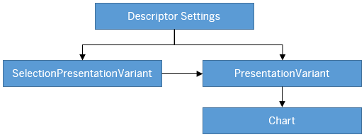
},Annotation: SelectionPresentationVariant with Qualifier="DefaultVariant"
Configuration Sample:
XML Annotation
<Annotation Term="UI.SelectionPresentationVariant" Qualifier="DefaultVariant">
  <Record>
    <PropertyValue Property="Text" String="Product Financial Analysis"/>
    <PropertyValue Property="SelectionVariant" Path="@UI.SelectionVariant#DefaultSelectionVariant"/>
    <PropertyValue Property="PresentationVariant" Path="@UI.PresentationVariant#DefaultPresentationVariant"/>
  </Record>
</Annotation>ABAP CDS Annotation
@UI.SelectionPresentationVariant: [
  {
    text: 'Product Financial Analysis',
    selectionvariantqualifier: 'DefaultSelectionVariant',
    presentationvariantqualifier: 'DefaultPresentationVariant',
    qualifier: 'DefaultVariant'
  }
]
annotate view VIEWNAME with {

}CAP CDS Annotation
UI.SelectionPresentationVariant #DefaultVariant : {
    Text : 'Product Financial Analysis',
    SelectionVariant : ![@UI.SelectionVariant#DefaultSelectionVariant],
    PresentationVariant : ![@UI.PresentationVariant#DefaultPresentationVariant]
}
Annotation: Presentation Variant
XML Annotation
<Annotation Term="UI.PresentationVariant" Qualifier="DefaultPresentationVariant">
  <Record>
    <PropertyValue Property="Text" String="Default"/>
    <PropertyValue Property="SortOrder">
      <Collection>
        <Record Type="Common.SortOrderType">
          <PropertyValue Property="Property" PropertyPath="NetAmount"/>
          <PropertyValue Property="Descending" Bool="true"/>
        </Record>
      </Collection>
    </PropertyValue>
    <PropertyValue Property="Visualizations">
      <Collection>
         <AnnotationPath>@UI.Chart#Default</AnnotationPath>
      </Collection>
   </PropertyValue>
  </Record>
</Annotation>ABAP CDS Annotation
@UI.PresentationVariant: [
  {
    text: 'Default',
    sortOrder: [
      {
        by: 'NETAMOUNT',
        direction: #DESC
      }
    ],
    visualizations: [
      {
        type: #AS_CHART,
        qualifier: 'Default'
      }
    ],
    qualifier: 'DefaultPresentationVariant'
  }
]
annotate view VIEWNAME with {

}
CAP CDS Annotation
UI.PresentationVariant #DefaultPresentationVariant : {
    Text : 'Default',
    SortOrder : [
        {
            $Type : 'Common.SortOrderType',
            Property : NetAmount,
            Descending : true
        },
    ],
    Visualizations : [
        '@UI.Chart#Default'
    ]
}
Use the app-descriptor
chartPresentationQualifier setting to render a chart based
on a specific PresentationVariant annotation
configuration.
"settings": {
"chartPresentationQualifier": "qualifier"}
Annotation: Chart
XML Annotation
<Annotation Term="UI.Chart" Qualifier="Default">
  <Record Type="UI.ChartDefinitionType">
    <PropertyValue Property="Title" String="Revenue by Customer"/>
    <PropertyValue Property="Description" String="Net Revenue by Customer"/>
    <PropertyValue Property="ChartType" EnumMember="UI.ChartType/Column"/>
    <PropertyValue Property="Dimensions">
      <Collection>
        <PropertyPath>SoldToParty</PropertyPath>
        <PropertyPath>DeliveryCalendarYear</PropertyPath>
      </Collection>
     </PropertyValue>
     <PropertyValue Property="DimensionAttributes">
       <Collection>
          <Record Type="UI.ChartDimensionAttributeType">
             <PropertyValue Property="Dimension" PropertyPath="SoldToParty"/>
             <PropertyValue Property="Role" EnumMember="UI.ChartDimensionRoleType/Category"/>
          </Record>
          <Record Type="UI.ChartDimensionAttributeType">
             <PropertyValue Property="Dimension" PropertyPath="DeliveryCalendarYear"/>
             <PropertyValue Property="Role" EnumMember="UI.ChartDimensionRoleType/Series"/>
          </Record>
       </Collection>
     </PropertyValue>
     <PropertyValue Property="Measures">
       <Collection>
         <PropertyPath>NetAmount</PropertyPath>
       </Collection>
     </PropertyValue>
     <PropertyValue Property="MeasureAttributes">
       <Collection>
          <Record Type="UI.ChartMeasureAttributeType">
             <PropertyValue Property="Measure" PropertyPath="NetAmount"/>
             <PropertyValue Property="Role" EnumMember="UI.ChartMeasureRoleType/Axis1"/>
             <PropertyValue Property="DataPoint" AnnotationPath="@UI.DataPoint#NetAmount"/>
          </Record>
       </Collection>
     </PropertyValue>
   </Record>
</Annotation>ABAP CDS Annotation
@UI.Chart: [
  {
    title: 'Revenue by Customer',
    description: 'Net Revenue by Customer',
    chartType: #COLUMN,
    dimensions: [
      'SOLDTOPARTY',
      'DELIVERYCALENDARYEAR'
    ],
    dimensionAttributes: [
      {
        dimension: 'SoldToParty',
        role: #CATEGORY
      },
      {
        dimension: 'DeliveryCalendarYear',
        role: #SERIES
      }
    ],
    measures: [
      'NETAMOUNT'
    ],
    measureAttributes: [
      {
        measure: 'NetAmount',
        role: #AXIS_1,
		asDataPoint: true
      }
    ],
    qualifier: 'Default'
  }
]
annotate view VIEWNAME with {

}
CAP CDS Annotation
UI.Chart #Default : {
    $Type : 'UI.ChartDefinitionType',
    Title : 'Revenue by Customer',
    Description : 'Net Revenue by Customer',
    ChartType : #Column,
    Dimensions : [
        SoldToParty,
        DeliveryCalendarYear
    ],
    DimensionAttributes : [
        {
            $Type : 'UI.ChartDimensionAttributeType',
            Dimension : SoldToParty,
            Role : #Category
        },
        {
            $Type : 'UI.ChartDimensionAttributeType',
            Dimension : DeliveryCalendarYear,
            Role : #Series
        },
    ],
    Measures : [
        NetAmount
    ],
    MeasureAttributes : [
        {
            $Type : 'UI.ChartMeasureAttributeType',
            Measure : NetAmount,
            Role : #Axis1,
            DataPoint : '@UI.DataPoint#NetAmount'
        }
    ]
}
Chart Operations
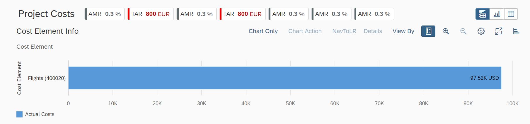
You can perform several chart-level operations on the toolbar. The Settings option on the chart toolbar enables you to include additional filters on the chart, or to change:
- Dimensions and measures bound to a chart
- Roles for dimensions and measures
- Sort order in charts
Semantic Navigation
If you select a data point or segment from a chart, the smart chart checks the annotation of any semantic object definition for these dimensions and uses it as a base to render the navigation links. For example:
Cost Center dimension
XML Annotation
<Annotations xmlns=http://docs.oasis-open.org/odata/ns/edm Target="Emp_Line_Item.Item/Cost_Center">
	<Annotation Term="com.sap.vocabularies.Common.v1.SemanticObject" String="CostCenter"/>
</Annotations>
ABAP CDS Annotation
annotate view ITEM with {
  @Consumption.semanticObject: 'CostCenter'
  cost_center;
}
In the preceding example, the smart charts retrieve all of the
navigation parameters for which you have authorization and that are defined for the
CostCenter semantic object. The selected chart and filter
context is passed to the target application through the navigation
context.
Choose Details on the toolbar to view navigation links that define actions associated with semantic objects.
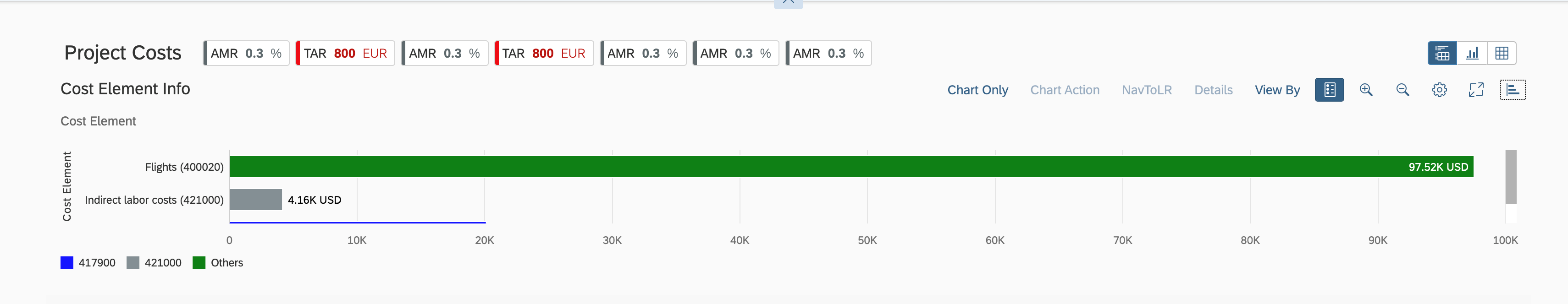
Enabling Data Label in Smart Charts and KPI Cards
You can show data labels in smart charts and KPI cards.
To do this, set the showDataLabel property to
True in the manifest settings. The default value is
False.
"pages": [{
            "entitySet": "SEPMRA_C_ALP_SlsOrdItemCubeALPResults",
            "component": {
                "name": "sap.suite.ui.generic.template.AnalyticalListPage",
                "list": true,
                "settings": {
                    "chartSettings": {
                        "showDataLabel": true
                    },
Enabling Stable Colors for Chart on Dimension Values
You can configure the chart to map the dimension values to specific colors. In
the absence of stable coloring, a default color is used for a value of
dimension. Legends are displayed as dimensionValues as per the
configuration in the manifest. You can configure this as follows:
-
Set the
enableStableColorsto true within thechartSettingsmanifest. -
Define colors and
LegendIndexfor dimensions.
manifest.json
"chartSettings": {
     "showDataLabel": true,
     "enableStableColors": true,
     "dimensionSettings": {
          "CostElement": {  // Dimension Name
              "400020": { //  Dimension Value
                   "color":"red",
                   "legendIndex":0
                        },
              "421000": {
                   "color":"sapUiChartPaletteSemanticNeutral",
                   "legendIndex":1
                        },
              "417900": {
                   "color":"blue",
                   "legendIndex":2
                        }
                         },
          "Customer": {
               "C000013": {
                    "color": "red",
                    "legendIndex": 0
                          },
               "C000085": {
                    "color": "blue",
                    "legendIndex": 0
                          },
                      },
          "default" : {
               "color": "green"
                      }
            }
  }
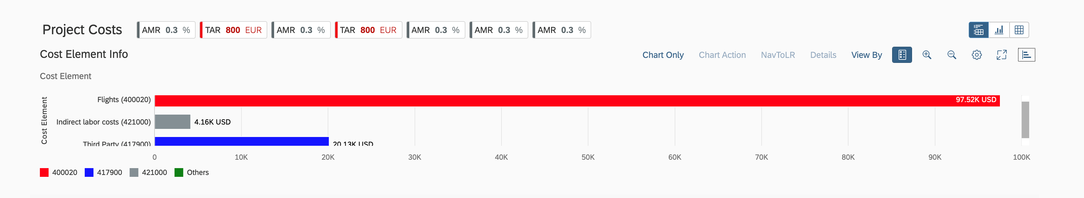
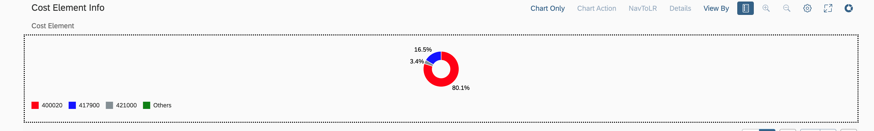
If a color isn't specified for a dimension value, and the default color is applied:
Defining Determining Actions
For more information, see Defining Determining Actions in List Reports.
Please note that this feature is deprecated. SAP Fiori elements supports this feature only for compatibility reasons. We recommend that you avoid using determining buttons.