Step 4: Quick Filter for the Worklist
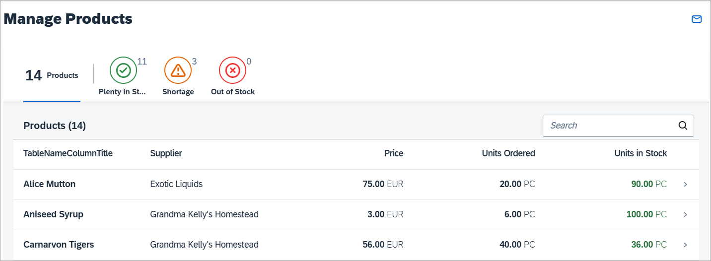
Preview
Coding
You can view and download all files in the Demo Kit at Worklist App - Step 4.
webapp/view/Worklist.view.xml [MODIFY]
<mvc:View
	controllerName="mycompany.myapp.MyWorklistApp.controller.Worklist"
	xmlns:mvc="sap.ui.core.mvc"
	xmlns:semantic="sap.f.semantic">

	<semantic:SemanticPage
		id="page"
		headerPinnable="false"
		toggleHeaderOnTitleClick="false">

		<semantic:titleHeading>
			<Title text="{i18n>worklistTitle}" />
		</semantic:titleHeading>

		<semantic:headerContent>
			<IconTabBar
				id="iconTabBar"
				select=".onQuickFilter"
				expandable="false">
				<items>
					<IconTabFilter
						key="all"
						showAll="true"
						count="{worklistView>/countAll}"
						text="{i18n>WorklistFilterProductsAll}"/>
					<IconTabSeparator/>
					<IconTabFilter
						key="inStock"
						icon="sap-icon://message-success"
						iconColor="Positive"
						count="{worklistView>/inStock}"
						text="{i18n>WorklistFilterInStock}"/>
					<IconTabFilter
						key="shortage"
						icon="sap-icon://message-warning"
						iconColor="Critical"
						count="{worklistView>/shortage}"
						text="{i18n>WorklistFilterShortage}"/>
					<IconTabFilter
						key="outOfStock"
						icon="sap-icon://message-error"
						iconColor="Negative"
						count="{worklistView>/outOfStock}"
						text="{i18n>WorklistFilterOutOfStock}"/>
				</items>
				<content>
					<Table
...
					</Table>
				</content>
			</IconTabBar>


		</semantic:headerContent>
		<semantic:sendEmailAction>
			<semantic:SendEmailAction
				id="shareEmail"
				press="onShareEmailPress"/>
		</semantic:sendEmailAction>
	</semantic:SemanticPage>
</mvc:View>
We now update the view and add the new UI for the quick filter to the content
aggregation of the sap.m.SemanticPage control just before the
table. It is modeled using a
sap.m.IconTabBar control and a
sap.m.IconTabFilter for each of the following filter
options:
-
Total Stock
This tab will simply show the overall number of products that has been returned by the data service. The
countproperty is bound to a local view model and the number will be updated in the controller later in this step. This tab will show a larger number only (optional) and no icon by using theshowAllproperty. -
Out of Stock
This tab will show all the products that are out of stock. We choose a matching icon from the icon font and set the icon color to the semantic
Negativestate so that it will appear in red. -
Shortage
This tab will show products that have less than 10 pieces remaining with a semantic
Criticalstate that will make the icon appear in orange. The count of the number of low stock products will be displayed on the tab and the icon will appear in orange. -
Plenty in Stock
This tab will show products that have more than 10 pieces in stock. The semantic
Positivestate will let the icon appear in green. As usual the UI texts for the tabs are linked to the resource bundle file and will be added later. Do not forget to set the standard CSS classsapUiNoMarginTopon the table to remove the spacing between theIconTabBarand thetableand make the UI look nicer.Each
IconTabFilterelement has akeyproperty that is used to identify the tab that was pressed in the event handleronQuickFilterthat is registered on theIconTabBarcontrol directly. The event handler implementation does the actual filtering on the table and is defined in the controller.
webapp/controller/Worklist.controller.js [MODIFY]
		...
		onInit : function () {
			var oViewModel,
				iOriginalBusyDelay,
				oTable = this.byId("table");

			// Put down worklist table's original value for busy indicator delay,
			// so it can be restored later on. Busy handling on the table is
			// taken care of by the table itself.
			iOriginalBusyDelay = oTable.getBusyIndicatorDelay();
			this._oTable = oTable;
			// keeps the search state
			this._aTableSearchState = [];

			// Model used to manipulate control states
			oViewModel = new JSONModel({
				worklistTableTitle: this.getResourceBundle().getText("worklistTableTitle"),
				shareOnJamTitle: this.getResourceBundle().getText("worklistTitle"),
				shareSendEmailSubject: this.getResourceBundle().getText("shareSendEmailWorklistSubject"),
				shareSendEmailMessage: this.getResourceBundle().getText("shareSendEmailWorklistMessage", [location.href]),
				tableNoDataText: this.getResourceBundle().getText("tableNoDataText"),
				tableBusyDelay: 0,
				inStock: 0,
				shortage: 0,
				outOfStock: 0,
				countAll: 0
			});
			this.setModel(oViewModel, "worklistView");
			// Create an object of filters
			this._mFilters = {
				"inStock": [new Filter("UnitsInStock", FilterOperator.GT, 10)],
				"outOfStock": [new Filter("UnitsInStock", FilterOperator.LE, 0)],
				"shortage": [new Filter("UnitsInStock", FilterOperator.BT, 1, 10)],
				"all": []
			};

			// Make sure, busy indication is showing immediately so there is no
			// break after the busy indication for loading the view's meta data is
			// ended (see promise 'oWhenMetadataIsLoaded' in AppController)
			oTable.attachEventOnce("updateFinished", function(){
				// Restore original busy indicator delay for worklist's table
				oViewModel.setProperty("/tableBusyDelay", iOriginalBusyDelay);
			});
		},
		...
As a preparation step for the filter tabs we add properties for the counters into
the local view model of the worklist controller. We initialize the four values
with 0 each. Furthermore, we create an object
_mFilters that contains a filter for each tab. We will use
the filters for filtering the table below the tabs. The properties in
_mFilters correlate to the keys of the
IconTabFilter controls we defined above in the
Worklist.view.xml file. This way we can easily access a
filter for a given tab based on the key of the corresponding tab.
Creating a simple filter requires a binding path as first parameter of the
filter constructor (e.g. "UnitsInStock"), a filter operator
(e.g. "GT") as second argument, and a value to compare (e.g.
10) as the third argument. We create such filters for all
three tabs with different filter operators as described in the view part above.
Additionally, we create an all filter, which is an empty array
for clearing the binding again (when the user chooses the
All tab).
webapp/controller/Worklist.controller.js [MODIFY]
		...
		onUpdateFinished : function (oEvent) {
			// update the worklist's object counter after the table update
			var sTitle,
				oTable = oEvent.getSource(),
				oViewModel = this.getModel("worklistView"),

				iTotalItems = oEvent.getParameter("total");
			// only update the counter if the length is final and
			// the table is not empty
			if (iTotalItems && oTable.getBinding("items").isLengthFinal()) {
				sTitle = this.getResourceBundle().getText("worklistTableTitleCount", [iTotalItems]);
				// Get the count for all the products and set the value to 'countAll' property
				this.getModel().read("/Products/$count", {
					success: function (oData) {
						oViewModel.setProperty("/countAll", oData);
					}
				});
				// read the count for the unitsInStock filter
				this.getModel().read("/Products/$count", {
					success: function (oData) {
						oViewModel.setProperty("/inStock", oData);
					},
					filters: this._mFilters.inStock
				});
				// read the count for the outOfStock filter
				this.getModel().read("/Products/$count", {
					success: function(oData){
						oViewModel.setProperty("/outOfStock", oData);
					},
					filters: this._mFilters.outOfStock
				});
				// read the count for the shortage filter
				this.getModel().read("/Products/$count", {
					success: function(oData){
						oViewModel.setProperty("/shortage", oData);
					},
					filters: this._mFilters.shortage
				});

			} else {
				sTitle = this.getResourceBundle().getText("worklistTableTitle");
			}
			this.getModel("worklistView").setProperty("/worklistTableTitle", sTitle);
		},
		...
In the onUpdateFinished function, we get the count of all
products by triggering a read operation on the model with the appropriate
filter. The filter is a helper object of SAPUI5 that defines
the condition for each tab on the data binding level. We already created the
filters in the onInit function.
The v2.ODataModel will automatically bundle these
read requests to one batch request to the server (if
batch mode is enabled).
In the success handler of each read operation
we update the corresponding property in the view model with the real count of
the matching items that were returned by the service.
webapp/controller/Worklist.controller.js [MODIFY]
		...
		_applySearch: function(aTableSearchState) {
			var oTable = this.byId("table"),
				oViewModel = this.getModel("worklistView");
			oTable.getBinding("items").filter(aTableSearchState, "Application");
			// changes the noDataText of the list in case there are no filter results
			if (aTableSearchState.length !== 0) {
				oViewModel.setProperty("/tableNoDataText", this.getResourceBundle().getText("worklistNoDataWithSearchText"));
			}
		},

		/**
		 * Event handler when a filter tab gets pressed
		 * @param {sap.ui.base.Event} oEvent the filter tab event
		 * @public
		 */
		onQuickFilter: function(oEvent) {
			var oBinding = this._oTable.getBinding("items"),
				sKey = oEvent.getParameter("selectedKey");
			oBinding.filter(this._mFilters[sKey]);
		}


	});

});
Next, we implement the handler for the select event of the
IconTabBar. In this event handler we get a reference to the
binding for the items aggregation of our table
and store it in the variable oBinding. Then we read the
parameter selectedKey from the event object to
find out which tab has been selected. This selectedKey is used
to get the correct filter for the selected tab. Next, we simply call the filter
method on oBinding and pass the correct filter of the selected
tab.
The filters are always applied as an array on the binding level, so you don't need to take care of managing the data, the data binding features of SAPUI5 will automatically take care.
webapp/i18n/i18n.properties [MODIFY]
...


#XTIT: The title of the products quick filter
WorklistFilterProductsAll=Products

#XTIT: The title of the out of stock products filter
WorklistFilterOutOfStock=Out of Stock

#XTIT: The title of the low stock products filter
WorklistFilterShortage=Shortage

#XTIT: The title of the products in stock filter
WorklistFilterInStock=Plenty in Stock


#~~~ Object View ~~~~~~~~~~~~~~~~~~~~~~~~~~
...
We finally add the texts for the tab filters to the resource bundle. Copy the
text definitions from the code section above to the end of the Worklistn
View section in the i18n file.
Now run the app again and click the filter icons on top of the table. The products should be filtered according to the selection in the filter bar and the count should match the number of items displayed.
Parent topic: Worklist App Tutorial
Previous: Step 3: Extending the Worklist Table