Setting the Table Type
manifest.json file and by using annotations.The following type properties are available within tableSettings:
ResponsiveTableGridTableAnalyticalTableTreeTable
The following logic is used to determine the table type on the list report page, and the object page:
-
If the table type is specified in the
manifest.jsonfile and set toanalytical, but theentitySetdoesn't have analytical capabilities, an empty table is displayed. Otherwise, the table is created with the specified table type. -
If the table type is not specified in the
manifest.jsonfile, the table type is selected automatically as follows:Default Table Type
Environment
Table Type
Analytical services containing the
@Aggregation.ApplySupportedannotation with all of the following transformation functions:filteridentityorderbyskiptopgroupbyconcataggregate
Analytical table
Hierarchical services containing the
@Aggregation.RecursiveHierarchyand the@Hierarchy.RecursiveHierarchyannotations with a sharedRecursiveHierarchyqualifierTree table
All other services
Responsive table
For more information about the guidelines and restrictions that apply to grid tables, see SAP Fiori Design Guidelines.
In the manifest.json file, you can control which table type is
rendered
on
the list report
page
and on the object page.
Grid tables, tree tables, and analytical tables do not support columns with
multi-line content, such as those using the FieldGroup
annotation or multi-line text fields.
Examples
Set the type property within tableSettings to
the required values in of the manifest.json file.
Example for the list report page:
"targets": {
    "SalesOrderManageList": {
        "type": "Component",
        "id": "SalesOrderManageList",
        "name": "sap.fe.templates.ListReport",
        "options": {
            "settings": {
                "controlConfiguration": {
                    "@com.sap.vocabularies.UI.v1.LineItem": {
                        "tableSettings": {
                            "type": "ResponsiveTable"
                        }
                    }
                }
                ...
            }
        }
    }
}
Example for the object page:
"targets": {
    "SalesOrderManageObjectPage": {
        "type": "Component",
        "id": "SalesOrderManageObjectPage",
        "name": "sap.fe.templates.ObjectPage",
        "options": {
            "settings": {
                "controlConfiguration": {
                    "_Item/@com.sap.vocabularies.UI.v1.LineItem": {
                        "tableSettings": {
                            "type": "GridTable"
                        }
                    }
                }
            }
        }
    }
}
Configuring the Popin Layout for Responsive Tables
When using a responsive table and there is not enough space to show all the columns, columns can be shown within popins using the Show More per Row option in the table toolbar.

The following popin layouts are supported:
Block(default): Sets a block layout for rendering the table popins. The columns inside the popin container are rendered one below the other.GridLarge: Sets a grid layout for rendering the table popins. The width of the grid for each table popin is larger thanGridSmall, so this layout renders less content in a single popin row.GridSmall: Sets a grid layout for rendering the table popins. The width of the grid for each table popin is small, so this layout allows more content to be rendered in a single popin row.
For more information about the size of the popin layouts, see the Fiori Design Guidelines.
You
can
configure the popin
layout
for each responsive table using the popinLayout parameter in
the tableSettings section. In the example below, the popin
layout is set to GridSmall.
manifest.json
"controlConfiguration": {
    "@com.sap.vocabularies.UI.v1.LineItem": {
        "tableSettings": {
            "type": "ResponsiveTable",
            "popinLayout": "GridSmall"
        }
    },
    ...
}
You can also define a default popin layout at the application level. A popin
layout defined at the table level takes precedence over a popin layout defined
at the application level. In the example below, the default popin layout is
GridLarge.
manifest.json
"sap.fe": {
    "macros": {
        "table":{
            "defaultPopinLayout": "GridLarge"
        }
    }
}
Annotating a Service as an Analytical Service
Analytical services must support the @Aggregation.ApplySupported
annotation. ABAP-based services must support the
@Aggregation.ApplySupported annotation along with all of
the following transformation functions:
filteridentityorderbyskiptopgroupbyconcataggregate
XML Annotation
<Annotation Term="Aggregation.ApplySupported">
    <Record>
        <PropertyValue Property="Transformations">
            <Collection>
                <String>filter</String>
                <String>identity</String>
                <String>orderby</String>
                <String>search</String>
                <String>skip</String>
                <String>top</String>
                <String>groupby</String>
                <String>aggregate</String>
                <String>concat</String>
            </Collection>
        </PropertyValue>
    </Record>
</Annotation>
ABAP CDS Annotation
@OData.applySupportedForAggregation: #FULL
CAP CDS Annotation
// at root level of your entity
@Aggregation.ApplySupported : {
}
The analytical table renders data that can be grouped and aggregated.
-
Defining Groupable Properties
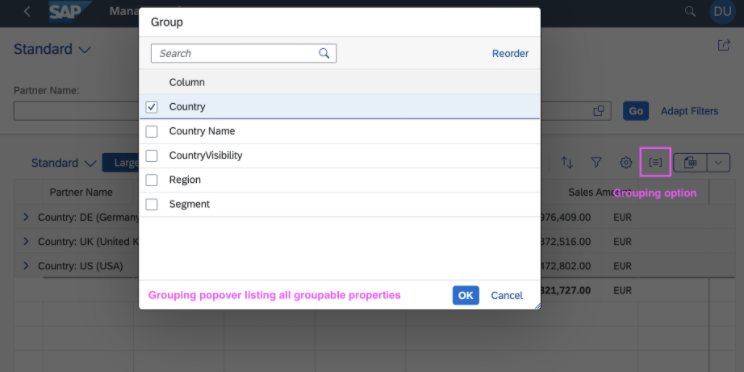
The analytical table offers the possibility to group rows based on groupable properties. You must define which properties are groupable so that the table allows grouping the relevant properties.
XML Annotation
<Annotations Target="sap.fe.managepartners.ManagePartnersService.Customers"> <Annotation Term="Aggregation.ApplySupported"> <PropertyValue Property="GroupableProperties"> <Collection> <PropertyPath>Segment</PropertyPath> <PropertyPath>Country</PropertyPath> </Collection> </PropertyValue> </Annotation> </Annotations>ABAP CDS Annotation
No ABAP CDS annotation is required. When a property lacks the
@Aggregation.defaultannotation (meaning it can't be aggregated), it automatically becomes a groupable property within an analytical service that has the@OData.applySupportedForAggregation: #FULLannotation.CAP CDS Annotation
@Aggregation.ApplySupported : {
    GroupableProperties: [Segment, Country]
}
Users can then group rows of the table:
-
Defining Aggregatable Properties
Aggregatable properties are defined in the metadata using the
@Aggregation.CustomAggregateannotation, which has the property name as the qualifier.XML Annotation
<Annotations Target="sap.fe.managepartners.ManagePartnersService.BusinessPartners/SalesAmount"> <Annotation Term="Aggregation.default" EnumMember="Aggregation.defaultType/SUM"/> <Annotation Term="Analytics.Measure" Bool="true"/> </Annotations> ... <Annotations Target="sap.fe.managepartners.ManagePartnersService.EntityContainer"> <Annotation Term="Aggregation.CustomAggregate" Qualifier="SalesAmount" String="Edm.Decimal"/> </Annotations>ABAP CDS Annotation
@Aggregation.default: #SUM

SalesAmount
CAP CDS Annotation
SalesAmount @Analytics.Measure : true @Aggregation.default : #SUM; //use the aggregation function you want
// At the entity level you must also define the Aggregation.CustomAggregate annotation which has the property name as the qualifier:
@Aggregation.CustomAggregate #SalesAmount : 'Edm.Decimal'
The analytical table displays only properties that are annotated as groupable and/or aggregatable. Otherwise, the property won't be requested and will have no value in the table.
-
Enabling and Disabling the Search Field
The Search field is enabled by default if no
Transformationsannotation is available. If theTransformationsannotation is available as part of theApplySupportedannotation, it needs to include thesearchtransformation for the Search field to be enabled.XML Annotation
<Annotations Target="sap.fe.managepartners.ManagePartnersService.Customers"> <Annotation Term="Aggregation.ApplySupported"> <Record Type="Aggregation.ApplySupportedType"> <PropertyValue Property="Transformations"> <Collection> <String>search</String> <String>topcount</String> <String>bottomcount</String> <String>identity</String> ... </Collection> </PropertyValue> </Record> </Annotation></Annotations>CAP CDS Annotation
@Aggregation.ApplySupported : { Transformations : [ 'search', 'topcount', 'bottomcount', 'identity', ... ], } -
Aggregation Based on Visible Properties
By default, an analytical table requests all key properties for the displayed entity even if these properties are not displayed within the table. To display aggregation based solely on visible columns, configure the
aggregationOnLeafLevelflag in themanifest.jsonfile as shown in the following sample code:manifest.json"controlConfiguration": { "@com.sap.vocabularies.UI.v1.LineItem": { "tableSettings": { "type": "AnalyticalTable", "analyticalConfiguration": { "aggregationOnLeafLevel": true }, "personalization": true } } }When
aggregationOnLeafLevelis set totrue, any navigation or bound actions are enabled only if all key properties of the entity are displayed in the table. If the missing key properties are added through the table settings, both the navigation and the bound actions are enabled.If the
rowPressevent is overridden at the table level, the navigation indicator is still displayed even whenaggregationOnLeafLevelis set totrue.In the following screenshots, Identifier is a key property:
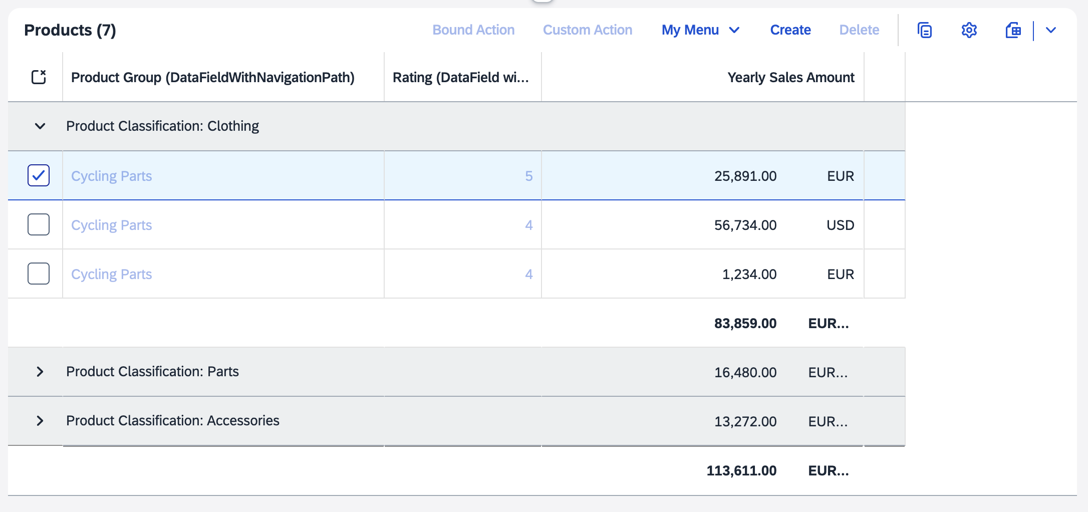
In the example above, the Identifier column is not displayed in the table, so navigation and bound actions are disabled.
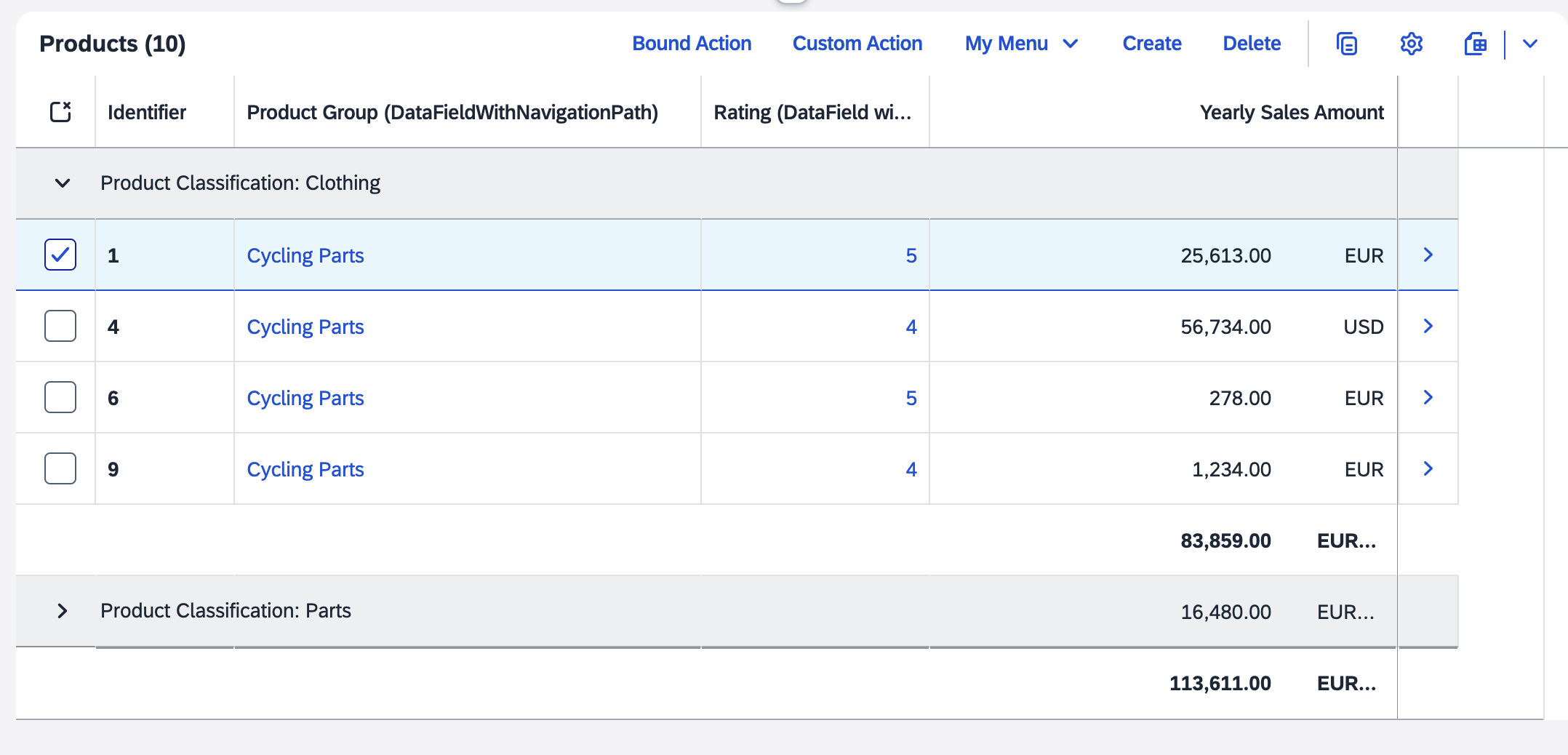
In the example above, the Identifier column is displayed in the table, so navigation and bound actions are enabled.
Analytical tables don't support navigation properties, so if you include them
through a LineItem, an empty column is displayed. You also
can't add navigation properties through the table personalization
settings.
Using an Analytical Table or Tree Table with a Draft-Enabled Service
The list report page can display an analytical table or tree table with a draft-enabled service with the following behavior:
-
Only the active entities are displayed.
-
The Editing Status field is not displayed in the filter bar.
-
The draft indicator is shown if a draft exists for an active record.
-
When creating a new object, the new object needs to be saved or discarded.
-
The behavior of already saved objects remains unchanged: a draft can be saved, kept, or discarded. The navigation is also unchanged.
When used on an object page or on a custom page, the analytical table is displayed in read-only mode, and delete and create operations aren't available. This behavior doesn't apply to the tree table.
An analytical table or tree table cannot be displayed on the list report page with a draft-enabled service in the flexible column layout.
Setting Transformation Filters on Aggregate Controls
SAP Fiori elements for OData V4 assumes that the back end supports transformation filters for aggregate controls, such as analytical tables. For more information about transformation filters, see OData Extension for Data Aggregation Version 4.0.
You must ensure the following:
-
The back end supports transformation filters for aggregate controls.
-
The following annotations must be added for aggregate entities:
XML Annotation
<Annotations Target="sap.fe.managepartners.ManagePartnersService.Customers"> <Annotation Term="Aggregation.ApplySupported"> <Record Type="Aggregation.ApplySupportedType"> <PropertyValue Property="Transformations"> <Collection> <String>filter</String> ... </Collection> </PropertyValue> </Record> </Annotation> </Annotations>CAP CDS Annotation
@Aggregation.ApplySupported : {
   Transformations : [
      'filter',
      ...
   ],
}
Activating the Tree Table
You can activate the tree table in the manifest.json file. To do
so, set the table type in the TableSettings
section to TreeTable and provide the hierarchy qualifier.
"controlConfiguration": {
                "@com.sap.vocabularies.UI.v1.LineItem": {
                  "tableSettings": {
                    "type": "TreeTable",
                    "hierarchyQualifier": "SalesOrgHierarchy",
                    "personalization": true
                  }
                }
              }
For more detailed information about using tree tables, see Tree Tables.
Defining the Number of Visible Rows
When a grid table is not the sole control within a section of an object page or
when the sectionLayout is set to Page, 5 fixed
rows are displayed in the table by default. In a tree table and an analytical
table, 10 fixed rows are displayed by default in the same situation. You can
change the number of rows displayed by defining the rowCount
and rowCountMode parameters within the table settings in the
manifest.json file as follows:
-
The
rowCountparameter defines the number of rows to be displayed in the table. -
The
rowCountModeparameter defines how the table handles the visible rows. This parameter doesn't apply to responsive tables. The following values are allowed:-
Fixed: The number of rows displayed in the table always matches the value defined in therowCountproperty. -
Auto: The number of rows is changed by the table automatically, adjusting to the space it is allowed to cover (limited by the surrounding container), but there are always at least as many rows as defined in therowCountproperty. -
Interactive: The user can change the number of displayed rows by dragging a resize handle.
-
"controlConfiguration": {
    "@com.sap.vocabularies.UI.v1.LineItem": {
        "tableSettings": {
	            "type": "GridTable",
                    "rowCount": 10,
                    "rowCountMode": "Fixed"
                    "personalization": true,
                     ...
        }
    },
    ...
}If the sectionLayout is set to
Tabs
and the table is the sole control within the section, the
rowCountMode is set to Auto.
More Information
For a description of the available table types, see Tables.
For information about setting up tables on the list report page through annotations, see Settings for List Report Tables.
For information about setting up a standard list or object list on the list report page, see Enabling Standard List Items and Object List Items.
For information about setting up tables in the object page, see Settings for Object Page Tables.
For information about table groupings, see Table Groupings.