Configuring Responsive Behavior of a Table
One of the biggest challenges in responsive web design (RWD) is presenting tabular data. Large tables containing lots of columns simply don't fit on smaller screens, and there is no easy way to reformat the table content with CSS and media queries for an acceptable visual display. To address this, our framework offers a column-based solution (column hiding) and row-based solution (pop-in behavior) for displaying tables responsively and both options are applicable at the same time. This may sound rather complicated, so let's look at an example.
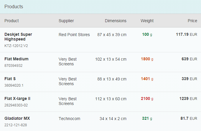
Say we want to build this nice table to display on a desktop:
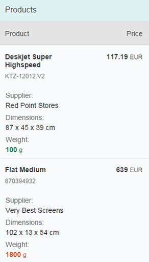
On mobile devices, we know that we won't have enough space to show all these columns, so we need to ask ourselves which columns are most important. Let's say:
- Product and Price are most important. So they should never be hidden.
- Supplier, Dimensions and Weight are not particularly important, so we'll only show them in the pop-in area.
If we apply these decisions we just made, our mobile devices should now look like this:
Responsive Column Control
You can control the responsive table design using the API of sap.m.Column.
This control provides two properties to handle column hiding and the pop-in
behavior.
minScreenWidth: This value defines the break point for the column visibility. For instance: An Apple iPhone 5 device has 568px x 320px resolution (dip/device-width), so if we assign 400px (or 25em based on 16px), then this column will not be visible for portrait mode (width 320px) but will be visible for landscape mode (width 568px). Instead of specifying in px or em, you can also assign one of the predefinedsap.m.ScreenSizetypes likeTablet(for 600px) orDesktop(for 1024px). The default value for this property is an empty string, meaning this column will always be visible.demandPopin: Depending on yourminScreenWidth, the column can be hidden in different screen sizes. Setting this property totrueshows this column in the pop-in area instead of hiding it. The default value is false.
And that's it! All you need to know are these two variables for responsive tables. So if we go back to our original example for a minute:
- Name and Status columns should never be
hidden. This is the default behavior of a column, so let's just let the default
values (
minScreenWidth:""anddemandPopin:false) do their job. - Model Number column should be hidden for small devices, so our break
point is
minScreenWidth:"Small"anddemandPopin:false(default value). - Quantity, Unit Price and Final
Price columns should go into our pop-in area, so our break point
is still
minScreenWidth:"Small"but now withdemandPopin:trueto show the column in a pop-in area. - For example, on tablets and wider devices we'll have more space available, so we can show
the Final Price column, but we'll revert to a pop-in mode
for smaller devices. So here our break point should be
minScreenWidth:"Tablet"anddemandPopin:true.
To achieve a valid table design, at least one column should always be visible and should not go into the pop-in area.
Automatic Pop-In Feature
There is an alternative configuration for simpler cases: Let
sap.m.Table itself take control of the responsive behavior.
The responsive table provides a feature where the table automatically moves the columns to the
pop-in area based on their importance. To enable this, simply set
autoPopinMode:true in the responsive table.
The default value of the importance property for a column is
"None". If there is no column importance defined, the
responsive table treats the first column as the most important column. The following
columns are treated as less important and are moved to the pop-in area
as
the browser window size is reduced.
You can change the default automatic pop-in behavior by defining the
importance property for the columns.
The columns are moved to the pop-in area in the following order based on their importance:
-
Columns with
Lowimportance -
Columns with
MediumandNoneimportanceThese are treated as equal and moved to the pop-in area when there are no columns with
Lowimportance. -
Columns with
Highimportance
Let's take the same example as before with the Product and
Price columns as the most important columns. They must
move to the pop-in area last. To achieve this, importance:"High"
must be set for the two columns. As you reduce the size of the browser window, the
columns with lower importance move to the pop-in area before the two columns
configured with High importance.
You can also hide columns with a specific importance in the pop-in area. To achieve
this, hiddenInPopin must be configured. For example, if you want to
hide all columns with "Low" and "Medium"
importance, you can define hiddenInPopin="Low,Medium".
Additionally, you can also listen to the popinChanged event of the
responsive table that is fired for every change of the pop-in area (columns moved in
or out of the pop-in
area).
For more information, see the Sample.
-
The automatic pop-in feature ensures that not all columns move to the pop-in area and there is always at least one visible column in the table.
-
The
demandPopinandminScreenWidthproperties of a column are configured by the responsive table.minScreenWidthis determined based on thewidthorautoPopinWidthproperties of the column if this feature is enabled. If there are any custom settings for thedemandPopinandminScreenWidthproperties, they will be overwritten by this feature.