Anchor Bar
ObjectPageLayout and allows the user to scroll to the respective
content.Overview
The anchor bar is an automatically generated internal menu that shows the titles of the sections and subsections and allows the user to scroll to the respective section and subsection content.
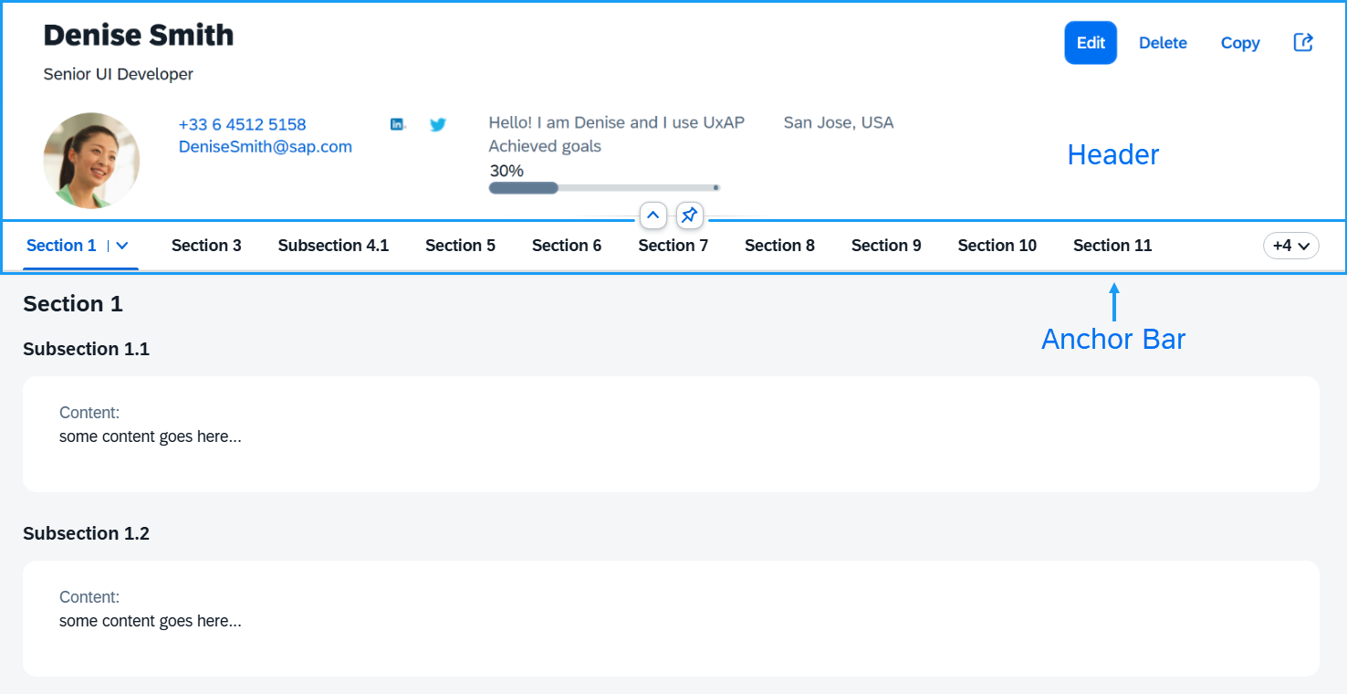
When the user scrolls the page content, the anchor bar remains at the top of the screen.
Usage
The anchor bar is displayed by default. You can hide it by using the
showAnchorBar property:
<ObjectPageLayout id="ObjectPageLayout" showAnchorBar="false">
</ObjectPageLayout>
In some apps or in some rendering modes of apps, it may not be desirable or necessary to
display the anchor bar. In these cases, you can hide it using the
setShowAnchorBar function.
oObjectPage.setShowAnchorBar(false);
The toggleAnchorBar event is fired by the ObjectPageLayout
control when the anchor bar is switched from moving to fixed.
An additional option for displaying the anchor bar is to use a
sap.m.IconTabBar control instead of the default
sap.uxap.AnchorBar. This is done with the
useIconTabBar boolean property. If set to
true, it will also set showAnchorBar to
false in order to avoid showing two navigation bars. This is
how it looks in the two views:
XML view:
<ObjectPageLayout id="ObjectPageLayout" useIconTabBar="true">
</ObjectPageLayout>
JavaScript:
oObjectPage.setUseIconTabBar(true);
Custom Anchor Bar Buttons
By default, you don't need to specify anything for a
sap.uxap.ObjectPageSectionBase to have its button included in
the anchor bar. At runtime, the ObjectPageLayout control creates a
button that has the same text as the corresponding section title. However, you may
want to use your own control for rendering the anchor bar button instead of the
default sap.m.Button. You can specify the custom control at
sap.uxap.ObjectPageSectionBase level, as shown here:
<ObjectPageSection>
    <customAnchorBarButton>
        <m:Button text="Employee Info"/>
    </customAnchorBarButton>
</ObjectPageSection>
Scrolling is handled automatically, so you don't need to add anything to enable this feature.
However, if you want to handle the press event differently, then
you can add an event handler to the button and can also optionally customize the
button.
<ObjectPageSection>
    <customAnchorBarButton>
        <m:Button text="Employee Info" press="handleAnchorBarPress" type="Transparent"/>
    </customAnchorBarButton>
</ObjectPageSection>
Here is an example showing the usage of custom controls for the anchor bar buttons:
<ObjectPageLayout id="ObjectPageLayout">
    <headerTitle>
        <ObjectPageHeader id="headerExpandedGrid" />
    </headerTitle>
    <sections>
        <ObjectPageSection id="section1" title="Employee Info" >
            <customAnchorBarButton>
                <!-- this sap.m.ToggleButton will be used in the anchor bar for navigating to that section -->
                <m:ToggleButton text="Employee Info" />
            </customAnchorBarButton>
        </ObjectPageSection>

        <ObjectPageSection  id="section2" title="Personal Info">
           <customAnchorBarButton>
                <!-- this sap.m.Button will be used in the anchor bar for navigating to that section -->
               <m:Button type="Accept" text="Personal Info" />
           </customAnchorBarButton>
        </ObjectPageSection>

    </sections>
</ObjectPageLayout>