Object Page Layout
ObjectPageLayout control provides a layout that allows apps to
easily display information related to a business object.Overview
The ObjectPageLayout layout is composed of a header (title and content), an
optional anchor bar, and block content wrapped in sections and subsections that
structure the information.
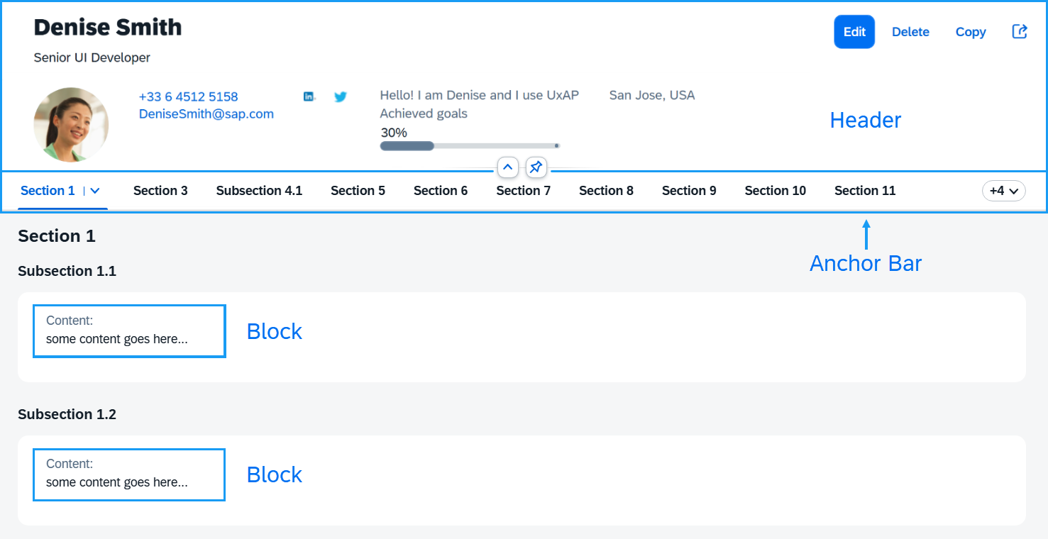
Header (Title and Content)
The ObjectPageLayout's header consists of two parts: header title
and header content.
The header title is the topmost part of the ObjectPageLayout that is
always visible. Its main purpose is to display the name of the represented business
object along with actions that the user can perform.
The header content scrolls along with the content of the page until it disappears (collapsed header). When scrolled back to the top it becomes visible again (expanded header). It contains all the additional information of the object.
Here is how the header title and header content are defined in both views:
XML view:
<ObjectPageLayout id="ObjectPageLayout">

	 <headerTitle>
		<ObjectPageHeader objectTitle="John Smith">
			<actions>
				<ObjectPageHeaderActionButton icon="sap-icon://edit" text="Edit" />
				<ObjectPageHeaderActionButton icon="sap-icon://save" text="Save" />
			</actions>
		</ObjectPageHeader>
	</headerTitle>

	<headerContent>
		<m:Label text="Personal description"/>
		<m:Text value="some KPI info"/>
	</headerContent>

</ObjectPageLayout>
JavaScript view:
// Create a header title, set the objectTitle property and add some action buttons
var oHeaderTitle = new sap.uxap.ObjectPageHeader();
oHeaderTitle.setObjectTitle("John Smith");
oHeaderTitle.addAction(new sap.uxap.ObjectPageHeaderActionButton({icon: "sap-icon://edit", text: "Edit"}));
oHeaderTitle.addAction(new sap.uxap.ObjectPageHeaderActionButton({icon: "sap-icon://save", text: "Save"}));
oObjectPage.setHeaderTitle(oHeaderTitle);

// Add arbitrary header content
oObjectPage.addHeaderContent(new sap.m.Label({text:"Personal description"}));
oObjectPage.addHeaderContent(new sap.m.Text({value:"some KPI info"}));
Sections, Subsections, Blocks
The content of the page that appears below the header is composed of blocks structured into sections and subsections.
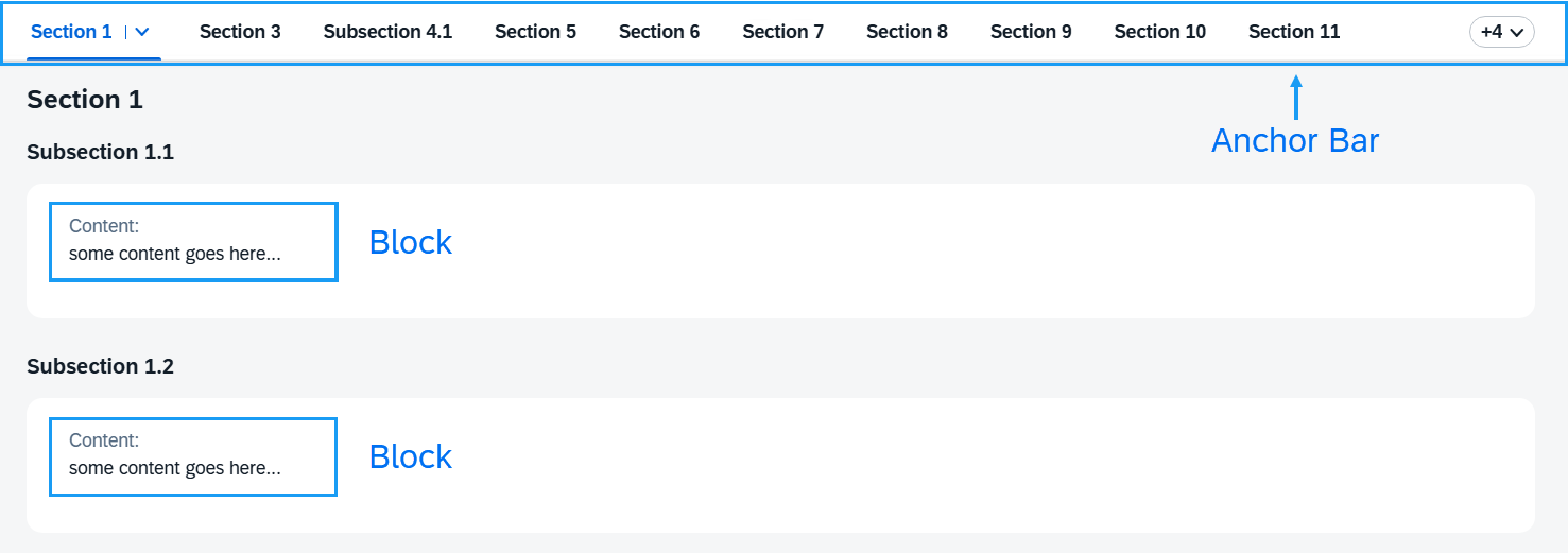
The blocks hold the actual app content, while the purpose of the sections and subsections is to define grouping.
A subsection groups together a set of blocks (under a common title), while a section groups together a set of subsections (under a common title).
The grouping enables the control to automatically create an internal menu (anchor bar) that shows the titles of the sections and subsections as separate anchors. The user can select them to scroll to the respective section or subsection content.
Here are some examples of how sections are initialized in both views:
XML view:
<ObjectPageLayout id="ObjectPageLayout" >
        <sections>
            <ObjectPageSection title="Payroll" >
                <subSections>
                    <ObjectPageSubSection title="sub payroll title">
                        <blocks>
                            <myNameSpace:myBlock/>
                            <myNameSpace:myBlock/>
                            <myNameSpace:myBlock/>
                        </blocks>
                    </ObjectPageSubSection>
                </subSections>
            </ObjectPageSection>
        </sections>
    </ObjectPageLayout>
JavaScript view:
var oSubSection1 = new sap.uxap.ObjectPageSubSection({title:"sub payroll title"});
var oSection1 = new sap.uxap.ObjectPageSection({title:"Payroll"});
oSection1.addSubSection(oSubSection1);
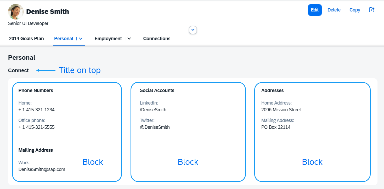
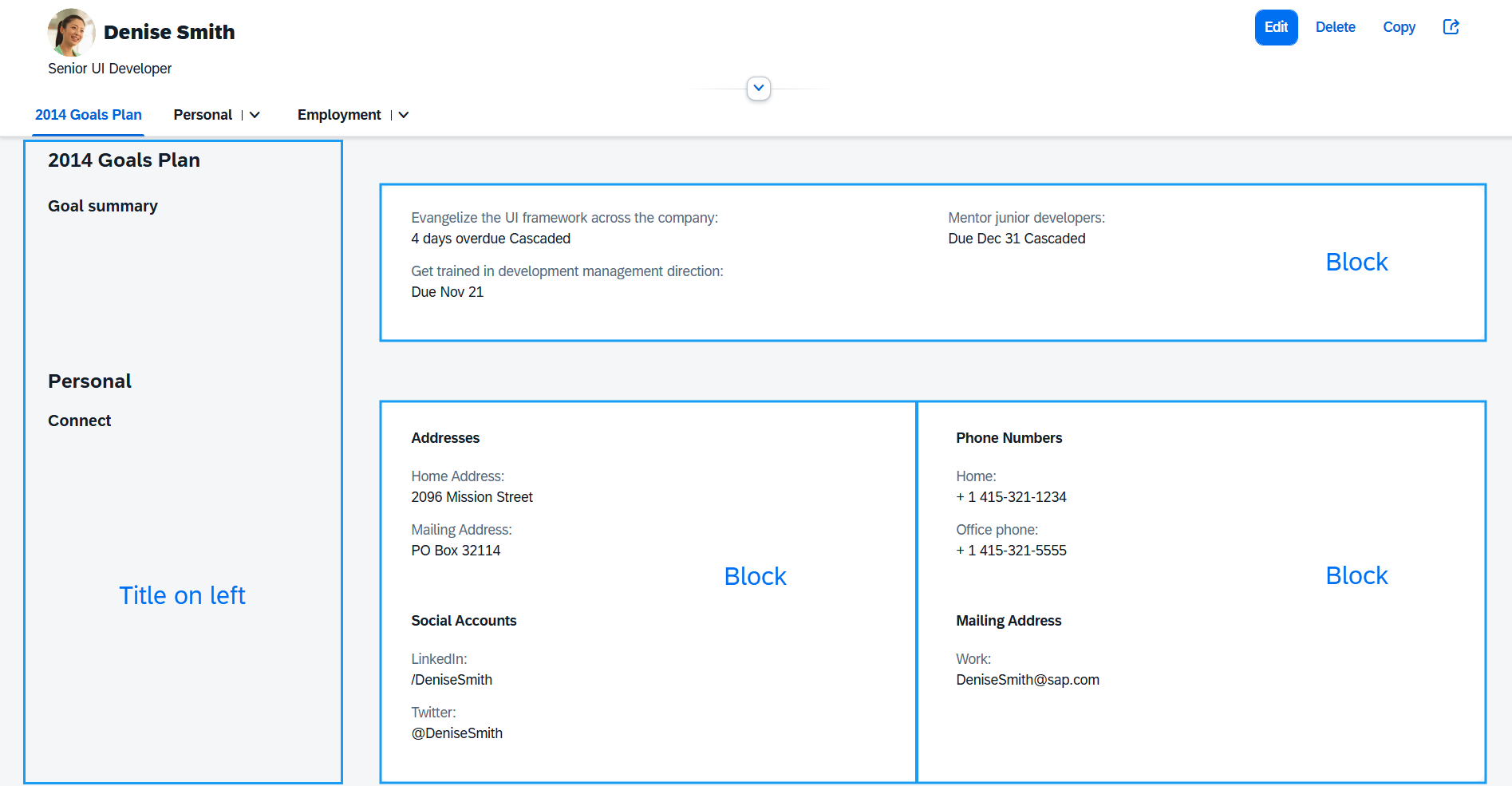
oObjectPage.addSection(oSection1);Layout Options
The subSectionLayout property provides information on how all the
underlying subsections arrange the blocks within their internal grid. The default is
set to titleOnTop, which arranges the blocks content in columns
where the first column is below the section and subsection titles.
Additionally, a second layout named titleOnLeft arranges the blocks
content from the second column, leaving the first one for section and subsection
titles only.
Here is how this property is set in the XML view:
<ObjectPageLayout id="ObjectPageLayout" subSectionLayout="titleOnTop">
        <sections>
            <ObjectPageSection title="Payroll" >
                <subSections>
                    <ObjectPageSubSection title="sub payroll title">
                        <blocks>
                            <myNameSpace:myBlock/>
                            <myNameSpace:myBlock/>
                            <myNameSpace:myBlock/>
                        </blocks>
                    </ObjectPageSubSection>
                </subSections>
            </ObjectPageSection>
        </sections>
    </ObjectPageLayout>
The moreBlocks aggregation of
sap.uxap.ObjectPageSubSection allows you to specify blocks to
be displayed only after the user clicks the internally created See
more button:
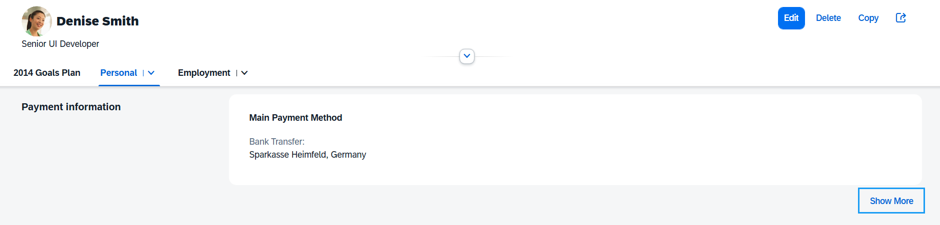
The See more button is only displayed for subsections that contain one of the following:
-
Visible blocks in the
moreBlocksaggregation -
Visible
BlockBaseblock that has theshowSubSectionMoreproperty set totrue
Additional Rules for Displaying Sections and Subsections
The following additional rules are internally applied to display the contents of the
ObjectPageLayout correctly. Each rule is applied to the output
of the preceding rule.
-
If the subsection content is empty (contains no blocks), it isn't displayed (no anchor is displayed for that subsection in the anchor bar and no title is displayed in the page body).
-
If the section content is empty (contains no subsections), it isn't displayed (no anchor is displayed for that section in the anchor bar and no title is displayed in the page body).
-
If a section without a title contains only one subsection with a title, the section gets the title of the subsection (
SectionTitle=SubsectionTitleandSubsectionTitle=NULL). -
If the
ObjectPageLayoutcontains only one section, no anchor bar is displayed. -
If there are more than one sections, the first one doesn't have a title.
Lazy Loading SAPUI5
The lazy loading mechanism allows you to load data only when the subsection blocks are inside or near the visible area on the screen. This way, you avoid sending too many requests from the start of the page loading.
Lazy loading is disabled by default. To enable it, set the
enableLazyLoading property to true:
<ObjectPageLayout id="ObjectPageLayout" enableLazyLoading="true">Next, you have to complete the setup of the blocks. There are two ways to set up lazy loading
on the subsection blocks. For the first one, all your subsection blocks must be
based on BlockBase, otherwise they're loaded as normal SAPUI5 components. The
second one is stashed-based and the content of subsection blocks must we wrapped
inside an ObjectPageLazyLoader.
Setting up lazy loading with BlockBase:
-
Set the
enableLazyLoadingproperty totrue. -
Each subsection block has modes and a view associated to each mode. At rendering time, the view associated to the mode is rendered.
-
Extend
sap.uxap.BlockBase:**sap.uxap.BlockBase.extend**("<BlockName>", { metadata: { } }); -
For each mode, declare its associated view:
sap.uxap.BlockBase.extend("<BlockName>", {
        metadata: {
            views: {
                **Collapsed: \{
                    viewName: "<collapsedViewName\>",
                    type: "XML"
                \},
                Expanded: \{
                    viewName: "<expendedViewName\>",
                    type: "XML"
**
                }
            }
         }
     });
Setting up stashed-based lazy loading:
-
Set the
enableLazyLoadingproperty totrue. -
Subsection block content must be wrapped inside
ObjectpageLazyLoader. -
The
stashedproperty ofObjectpageLazyLoadermust be set totrue:<ObjectPageLazyLoader stashed="true" id="SectionStashed">
This unstashes the content automatically as the user scrolls.
Subsections are required to have an ID when used with
ObjectPageLazyLoader, otherwise the content doesn't become
unstashed.
The ObjectPageLayout control ensures that only the visible blocks and those
next to them have loaded their data, but not the entire page. As the user scrolls or
navigates within the page, new data is requested as needed.
Setting enableLazyLoading to true after the
ObjectPageLayout has been instantiated doesn't work, as all
bindings are resolved by then.