Step 3: Go!
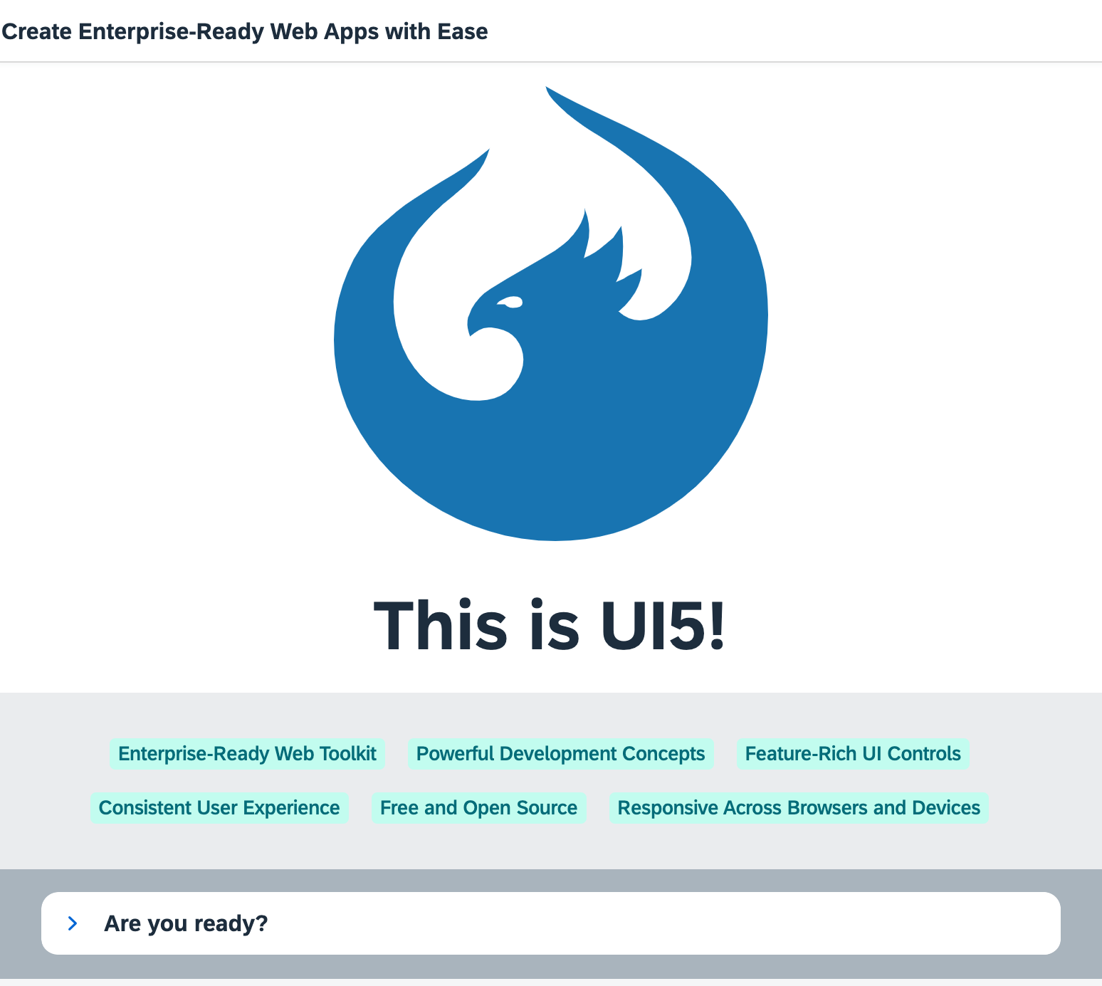
Preview
Coding
You can view and download all files at Quick Start - Step 3.
webapp/index.html
<!DOCTYPE html>
<html>
<head>
	<meta charset="utf-8">
	<title>Quickstart Tutorial</title>
	<script id="sap-ui-bootstrap"
		src="resources/sap-ui-core.js"
		data-sap-ui-libs="sap.m, sap.ui.layout, sap.tnt"
		data-sap-ui-compat-version="edge"
		data-sap-ui-async="true"
		data-sap-ui-on-init="module:ui5/quickstart/index"
		data-sap-ui-resource-roots='{
			"ui5.quickstart": "./"
		}'>
	</script>
</head>
<body class="sapUiBody" id="content"></body>
</html>
Let's spice up our app by adding some more UI controls. We add two more libraries in the bootstrap tag: sap.ui.layout
and sap.tnt.
To browse all available controls and libraries, see the Samples.
webapp/App.view.xml
<mvc:View
	controllerName="ui5.quickstart.App"
	displayBlock="true"
	xmlns="sap.m"
	xmlns:mvc="sap.ui.core.mvc"
	xmlns:l="sap.ui.layout"
	xmlns:core="sap.ui.core"
	xmlns:tnt="sap.tnt">
	<App id="app">
		<Page title="My App">
			<Button
				icon="sap-icon://sap-ui5"
				text="Go!"
				press=".onPress"
				type="Emphasized"
				class="sapUiSmallMargin"/>
		</Page>
		<Page id="intro" title="Create Enterprise-Ready Web Apps with Ease">
			<l:BlockLayout background="Light">
				<l:BlockLayoutRow>
					<l:BlockLayoutCell>
						<core:Icon color="#1873B4" src="sap-icon://sap-ui5" size="20rem" class="sapUiMediumMarginBottom" width="100%"/>
						<Title level="H1" titleStyle="H1" text="This is UI5!" width="100%" textAlign="Center"/>
					</l:BlockLayoutCell>
				</l:BlockLayoutRow>
				<l:BlockLayoutRow>
					<l:BlockLayoutCell>
						<FlexBox items="{/features}" justifyContent="Center" wrap="Wrap" class="sapUiSmallMarginBottom">
							<tnt:InfoLabel text="{}" class="sapUiSmallMarginTop sapUiSmallMarginEnd"/>
						</FlexBox>
					</l:BlockLayoutCell>
				</l:BlockLayoutRow>

				<l:BlockLayoutRow>
					<l:BlockLayoutCell>
						<Panel headerText="Are you ready?" expandable="true">
							<Switch change=".onChange" customTextOn="yes" customTextOff="no"/>
							<l:HorizontalLayout id="ready" visible="false" class="sapUiSmallMargin">
								<Text text="Ok, let's get you started!" class="sapUiTinyMarginEnd"/>
								<Link text="Learn more" href="https://sdk.openui5.org/"/>
							</l:HorizontalLayout>
						</Panel>
					</l:BlockLayoutCell>
				</l:BlockLayoutRow>
			</l:BlockLayout>
		</Page>

	</App>
</mvc:View>
We also define the two new libraries in the View tag and give them a meaningful prefix. To the App
control, we will assign an ID so that the controller can easily identify it.
The button now receives an icon and triggers our navigation to page two. Therefore, we change the text to "Go!".
Copy the second Page control with all its content into the view. It is defined with the intro ID and
a new title. It contains several new UI controls like a BlockLayout, an Icon, and a
Panel.
We use essential SAPUI5 concepts like navigation, data binding, and user interaction to define a nice playground on the second page of our app.
Don't worry too much about the details, we will explain them in the next tutorials.
webapp/App.controller.js
sap.ui.define([
	"sap/ui/core/mvc/Controller",
	"sap/m/MessageToast",
	"sap/ui/model/json/JSONModel"
], (Controller, MessageToast, JSONModel) => {
	"use strict";

	return Controller.extend("ui5.quickstart.App", {
		onPress() {
			MessageToast.show("Hello UI5!");
			this.byId("app").to(this.byId("intro"));
		},

		onInit() {
			this.getView().setModel(new JSONModel({
					features: [
						"Enterprise-Ready Web Toolkit",
						"Powerful Development Concepts",
						"Feature-Rich UI Controls",
						"Consistent User Experience",
						"Free and Open Source",
						"Responsive Across Browsers and Devices"
					]
				})
			);
		},

		onChange(oEvent) {
			const bState = oEvent.getParameter("state");
			this.byId("ready").setVisible(bState);
		}
	});

});
The onPress function now also triggers the navigation to the intro page. We fetch the
app control by its ID and instruct it to navigate by calling the to method.
The onInit method is a lifecycle hook that is called automatically when the controller is initialized. It defines a
simple JSON model with some texts located at the features key.
We display these texts on the second page using data binding. The InfoLabel tag from our view is a template that is
repeated as many times as we have entries in our model.
Finally, we make the Panel in the lower part of the view interactive by attaching an onChange event to the switch
defined there. SAPUI5 comes with a large set of feature-rich controls
that you can combine as you need.
Run the app, and navigate to the second page to see some nice UI controls and interaction. If we expand the panel and click the switch, we toggle the visibility of the text and the link next to it.
You now have a little playground in your app that you can modify and extend as you wish. We intentionally did not go into all the details. If you want to know more, just continue with the Walkthrough tutorial.
Have fun with SAPUI5!
Parent topic: Quickstart Tutorial
Previous: Step 2: Steady...